

You're scrolling through a shop tab or a feed, and every other post is an oversized tee with a chrome logo, a butterfly, or a glitchy number graphic. One looks perfect in the photo, but you can't tell if it'll still look good after a wash, whether the fit is boxy, or if the print is just doing all the work. That's the Y2K graphic tee problem: the look is easy to spot, but it's much harder to buy well.
A good Y2K tee should do more than give you one solid outfit pic. It should have the right silhouette, the right fabric weight, and a print that still holds up after you wear it on repeat. The graphic tee format has been around in different forms for a long time, but the Y2K version adds a very specific early-2000s attitude, glossy, techy, nostalgic, and a little loud.
Table of Contents
- Why Y2K Graphic Tees Keep Coming Back
- Where the Y2K Look Actually Came From
- What Makes a Tee Look and Feel Y2K
- Outfit Formulas for Different Lives
- How to Choose the Right Fit, Fabric, and Print
- Vintage vs Repro and How to Spot the Difference
- Care Instructions That Actually Protect the Print
- Gifting, Styling, and Where to Shop Next
Why Y2K Graphic Tees Keep Coming Back
You're standing in front of a screen full of oversized tees, and half of them look fun for a photo while the other half look like they'd disappear into the back of your closet after one week. The reason the Y2K version keeps winning is simple, it gives you a clear style signal without demanding a full costume. A tee is easier to live in than rhinestone denim, lower-risk than tiny trend accessories, and much simpler to style in real life.
The look also has a built-in story. Y2K graphics pull from a period tied to the Year 2000 computer bug, and that era still feels instantly recognizable because it sits at the intersection of tech anxiety and tech optimism. The public memory of that moment was huge, with Gartner estimating global Y2K fixes at $300 billion to $600 billion, and one research summary saying programmers corrected well over 95% of related problems before the date change, which helps explain why the motif still carries historical weight today. You can read that context in the Smithsonian's Y2K collection notes, which frame the era as a major cultural and technical milestone.[^1]
Why the tee format works so well
A graphic tee is already a proven fashion object, not a niche experiment. Its lineage runs from military underwear in 1913 to a self-expression piece in the 1950s and 1960s, then into mainstream branding later on, with screen printing and Plastisol ink helping the category become scalable in 1959 and broader production technology arriving in the early 1960s.[^2] That long history matters because it makes Y2K graphics easy to adapt, whether the print leans music, city, auto, or bootleg-style humor.
Practical rule: if a trend can live on a T-shirt, it usually lasts longer than a trend that needs special pants, shoes, and accessories to make sense.
For a newcomer, that's the smart entry point. A Y2K tee can be subtle enough for everyday wear, but it still gives you the early-2000s feel that people are chasing right now. The rest of the decisions, fit, fabric, print, and authenticity, are what separate a shirt you'll keep from one you'll stop wearing after the first post.
Where the Y2K Look Actually Came From
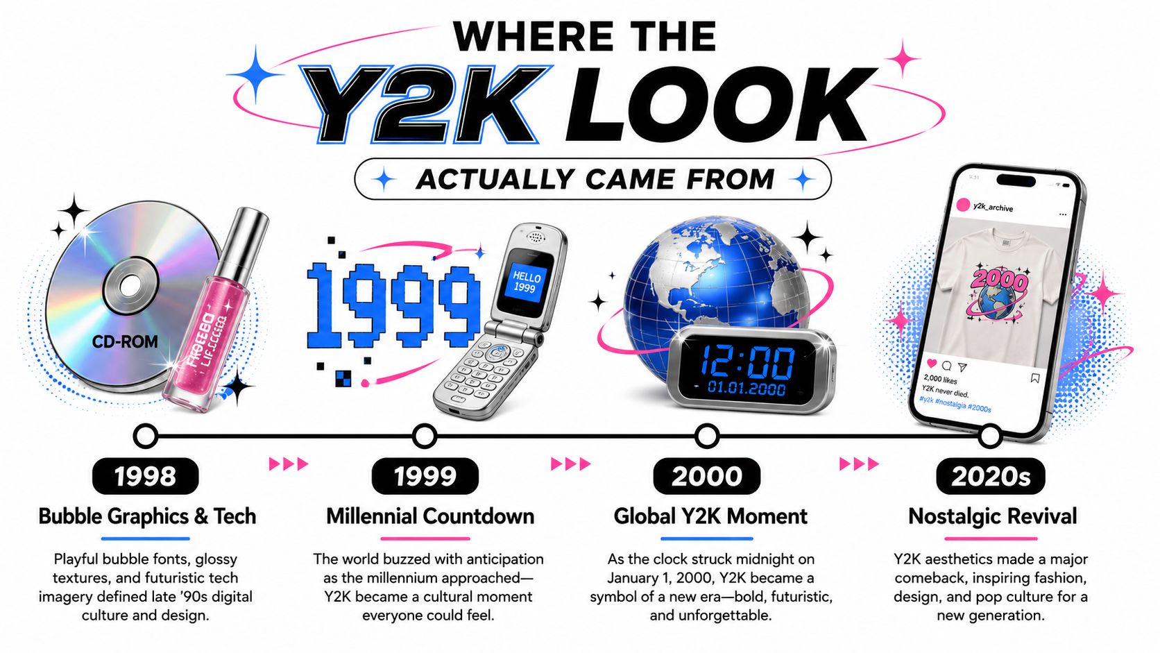
The Y2K look didn't come from one exact garment. It came from a very specific cultural window, the late-1990s run-up to January 1, 2000, when technology felt futuristic, a little unstable, and visibly modern all at once. That's why the aesthetic still reads as more than generic retro. It's tied to a globally shared milestone, and the graphics often point directly at that moment through futuristic numerals, shiny finishes, and early-web visual language.[^1]
The visual cues that make it feel right
A true Y2K graphic usually leans into a few recognizable details. Think metallic looks, glossy color palettes, bubble-like type, flip-phone imagery, butterflies, and bootleg-style compositions that feel half fan art, half streetwear. Those cues show up because the era itself mixed tech optimism with pop culture saturation, so the tee ends up feeling playful and slightly digital instead of vintage in a more general sense.
Why the style spread so fast
The graphic tee format was already mature by the time Y2K imagery hit mainstream taste, so the aesthetic could scale immediately. That's one reason the category appears across music, automotive, and city-themed shirts so easily now, the blank canvas already existed. Once designers had a shirt shape that people understood, the Y2K look just had to supply the visual code.
The cleanest way to identify the era is to ask whether the graphic feels like early internet optimism, not just “old.” If the shirt could only belong to the 1980s or 1990s, it's probably not Y2K.
That distinction matters in stores and marketplaces. A shirt with a shiny number graphic or a chrome-like print can still miss the mark if the rest of the design language feels off. Y2K is specific because it borrows from a moment when digital life was starting to seep into everyday style, and the graphics kept that energy visible on the chest.
What Makes a Tee Look and Feel Y2K
A Y2K tee can look right in a listing and still fail in real life if the cut, cloth, and print don't cooperate. The first thing to check is the silhouette. Market examples for Y2K graphic tees are usually built with a loose, oversized shape, and that oversized drape is part of the point. Chest widths in the 42.5 to 47.2 in range on Amazon and flat-measured busts of 110 to 126 cm on TikTok Shop listings show how much ease these tees need to keep that boxy, era-correct feel.[^3]
Fit does more than change the size
An oversized Y2K tee isn't just a bigger regular tee. It's cut with extra room in the chest and shoulder so the fabric hangs with that relaxed streetwear shape. That's also why people get disappointed when they buy a shirt that says “oversized” but fits like a long, narrow basic tee. The print can be perfect, but if the body is too slim, it won't read as Y2K.
Fabric matters just as much. Listings commonly lean on 100% cotton, often with an acid-wash or soft finish, which helps the shirt feel more era-specific and visually worn in.[^3] Cotton is comfortable, but sellers also warn that it can shrink 1–2 in after the first wash, so a shirt that fits barely right on arrival can turn into the wrong size very quickly.[^3]
Print and fabric work together
The print side has moved toward actual production specs, not just styling. Product pages and apparel listings commonly reference 300 DPI artwork, with PNG, SVG, and PDF inputs used for clean edges, while durable DTF and DTG printing methods are common for detailed graphics.[^4] That's useful because a crisp design on bad fabric still won't age well, and a heavier knit can support the print better than a very thin shirt.
Market examples also show how weight changes the hand-feel, from lightweight 142 g/m² combed ring-spun cotton to heavier 260 gsm cotton knits.[^4] Lighter shirts usually breathe better in warm weather and feel softer, while heavier knits can hold a boxier shape and reduce transparency. The best choice depends on whether you want a floaty summer tee or a more structured streetwear piece.
Outfit Formulas for Different Lives
The same Y2K graphic tee can read totally differently depending on what it's paired with. A loud front print with denim and sneakers feels casual. The same shirt under a layer or tucked into cleaner bottoms can shift toward intentional and adult. That's why the tee works for more than one age group, it can be expressive without forcing you into one exact styling lane.
| Vibe | Tee Style | Pair With |
|---|---|---|
| Relaxed everyday | Soft graphic with a simple Y2K print | Straight-leg denim and clean sneakers |
| Concert or late-night | Brighter print or bootleg-style graphic | Baggy pants and a trucker cap |
| Layered streetwear | Oversized tee with stronger visual contrast | Quarter-zip layer, relaxed bottoms |
| Gift-ready clean look | Minimal Y2K reference, less loud | Neutral jeans and simple accessories |
How the same shirt changes character
A relaxed everyday outfit usually works best when the tee is the main statement and everything else stays easy. Straight-leg denim keeps the shape balanced, and a cleaner sneaker stops the look from tipping into costume territory. For concerts or nights out, louder graphics and more contrast make sense because the outfit is supposed to read from a distance.
Layering is where oversized tees really earn their keep. A quarter-zip over a graphic tee gives you structure without hiding the print completely, and it's a solid way to wear the trend if you don't want to go all-in. A trucker cap can add to that streetwear feel fast, especially with music-, auto-, or city-themed graphics.
If you're buying for someone younger, the louder bootleg and rhinestone-heavy direction usually makes more sense. If you want something more subtle, look for archival-feeling prints, cleaner color palettes, and less crowded graphics. The shirt should match the wardrobe it's going into, not fight it.
Good styling test: if the tee needs three extra trend pieces to make sense, it's too dependent on styling. If it works with jeans and sneakers on its own, it's easier to wear long term.
How to Choose the Right Fit, Fabric, and Print
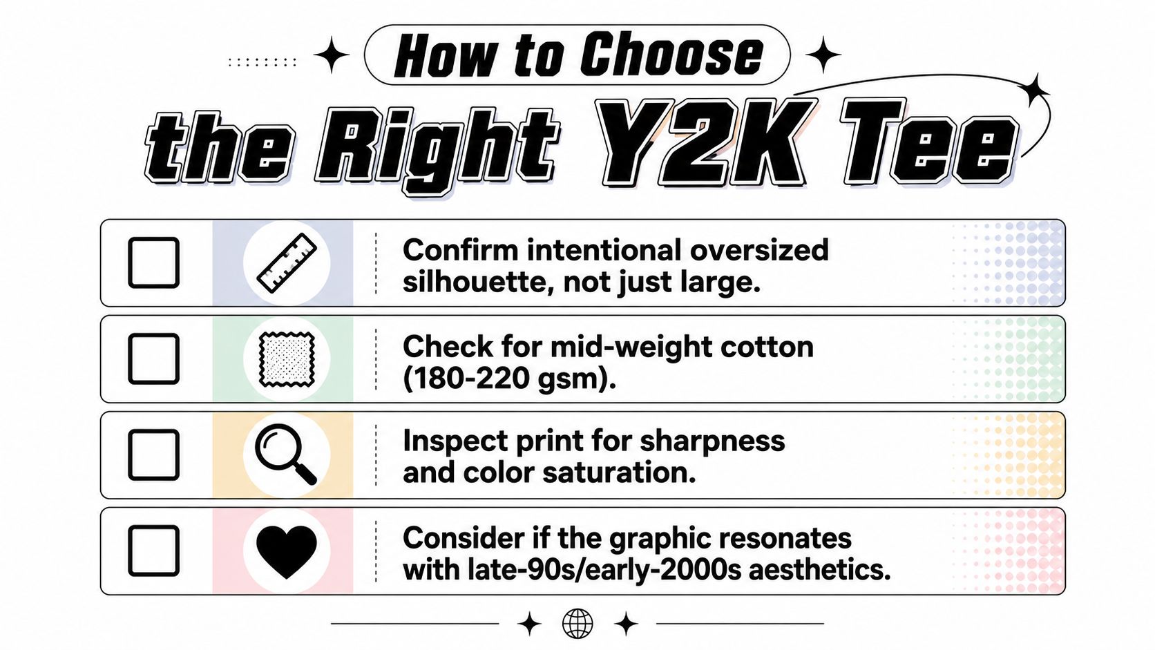
People buy graphic tees by looking at the front image first, then regret the shirt when the sleeves are too long or the fabric feels flimsy. A better approach is to shop like you're checking a product spec sheet, not just a mood board. Start with the cut, then move to cloth weight, then inspect the print.
A fast checklist before checkout
- Confirm the silhouette first. Look for intentional oversized shaping, drop shoulders, or garment measurements that show real room through the chest and shoulder.
- Check the fabric weight. Mid-weight cotton usually gives you a better balance of drape and structure, while ultra-light fabric can go sheer or clingy.
- Inspect the print. Crisp edges, even color, and a placement that sits correctly on the chest matter more than an image that just looks strong on a white background.
- Match the graphic to your style. If the image feels like late-1990s or early-2000s pop culture, tech, or bootleg streetwear, it's probably in the right lane for the trend.
What to avoid
Sleeves that drape too far past the elbow can make a tee feel sloppy instead of oversized. Thin fabric can also make the shirt look cheap the second it's worn, especially with a bold front print that has no structure to sit on. If you see strong graphics on a very light shirt, ask yourself whether the shirt will still look intentional after washing.
The safest buy is usually a well-cut 100% cotton tee in a heavier knit, especially if you want the silhouette to keep its shape. A cheaper option might look fine in the product photo, but the wrong fabric can flatten the whole idea. Good Y2K tees need both the reference and the build.
Vintage vs Repro and How to Spot the Difference
A lot of shoppers ask the same question when they see a Y2K tee online: is it vintage, or just a new shirt with the right graphic language? In most cases, the answer is modern reproduction. That doesn't make it a bad buy, but it does change what you should look for and what you can reasonably expect from the garment.
Signs that point to an older original
Older pieces often show details that modern shirts don't copy exactly. Single-stitch hems, era-specific tags, and worn fabric hand-feel can all hint at a genuine vintage garment. Print cracking can happen on originals too, but the pattern of wear usually looks natural and tied to age, not artificially distressed. Licensing marks can also help, since older licensed graphics often reflect the branding habits of their time.
Why reproduction is often the smarter purchase
Modern reproductions give you more consistency. Sizing is easier to predict, the print can be sharper, and the shirt is usually simpler to replace if you want a second colorway or a backup. For shoppers who care more about wearing the look than owning a period-correct artifact, that trade-off makes sense.
Practical rule: if you can't verify the age of the piece, buy it for the design and construction, not the story attached to it.
That mindset also helps with anti-counterfeit shopping. Stick with sellers who show clear product imagery, actual garment shots, and transparent policies, because graphic-led streetwear can be easy to misrepresent in cropped photos. If a listing hides the tag, the seams, and the measurements, treat that as a warning sign rather than a mystery to solve after checkout.
Care Instructions That Actually Protect the Print
Most graphic tees don't fail because the design was weak. They fail because the wash routine is too harsh. If you want the print to last, start with cold machine wash at 30C or 90F, turn the shirt inside out, skip chlorine bleach, use low-heat tumble drying, and iron on low heat without touching the print directly.
Why each step matters
Heat can break down the binders that hold the print in place. Agitation lifts edges, especially on bigger graphics, and bleach attacks both dye and ink. Turning the shirt inside out keeps the face of the graphic from rubbing against zippers, buttons, and other clothes in the drum.
Storage matters too. Heavy knits are usually better folded than hung, because hanging can stretch the shoulders over time. If you cram too many tees into one drawer, the stacked pressure can press on the print and leave it looking tired before the shirt itself is worn out.
A simple routine beats an overcomplicated one. Wash it gently, dry it gently, and keep the print from being the thing that takes the most abuse in your laundry load.
Gifting, Styling, and Where to Shop Next
Y2K graphic tees make sense as gifts because they're easy to understand at a glance, forgiving on fit, and flexible enough for different wardrobes. If you're buying for someone else, start with what they already wear, choose a color they'll use, and care more about print durability than the loudest graphic in the row. A tee that survives repeated wear is a better gift than one that only works for one outfit.
That same logic helps when you're shopping for yourself. If you want music, automotive, or city-themed graphics in a consistent streetwear lane, a focused storefront is easier to browse than a giant mixed catalog. Trending Market carries graphic-led T-shirts, trucker caps, and related pieces in that kind of visual language, so it's a natural place to compare styles once you know what fit and print details you want.
If you're ready to buy smarter, use the checklist from the sections above, then pick the tee that feels right in the hand, not just on the screen.
Trending Market offers streetwear-inspired graphic tees and related accessories that fit the same music, automotive, and city-reference lane covered here. If you want to compare Y2K-friendly graphics with everyday wearability, visit Trending Market and look for the pieces that match your fit, fabric, and print preferences.