

When getting ready to go out, you pull open the closet, scan past the safe basics, and reach for the one shirt that says something without you having to explain yourself. Not louder. More specific. The tee that tells people you care about a sound, a city, a car, a mood, or a whole lane of culture.
That's why urban graphic tees keep sticking around. They aren't just easy outfits. They're shorthand. A tour photo tee can read like memory. A BMW E36 print can signal taste before you say a word. A city graphic can feel like hometown pride, borrowed identity, or the version of yourself you're building.
Table of Contents
- More Than a Shirt What Are Urban Graphic Tees
- Decoding the Designs Common Themes and Motifs
- Fabric and Fit The Foundation of a Great Tee
- How to Style Your Urban Graphic Tee
- Shopping Smart Sizing, Care, and Gifting on a Budget
- Wear Your Story The Last Word on Urban Tees
More Than a Shirt What Are Urban Graphic Tees
Urban graphic tees sit at the point where casual clothing meets personal code. They're wearable references. Music, cars, city names, old-school iconography, washed textures, photo prints, cracked ink, oversized cuts. None of that is random. Each choice tells people what you notice and what you align with.
The reason they matter goes beyond trend cycles. The global graphic tees market was valued at USD 72.66 billion in 2023 and is projected to reach USD 125.04 billion by 2032, according to Wise Guy Reports on the global graphic tees market. That growth reflects a bigger shift in how people dress. Buyers want clothes that work like basics but still carry identity.
The shirt does two jobs
A good urban graphic tee has to handle two things at once:
- Wearability: It has to work on a normal day with cargos, denim, shorts, or layered outerwear.
- Meaning: It has to suggest a world. Music fandom. JDM loyalty. Downtown energy. A gritty photo reference. A cleaner minimalist flex.
That's why the best ones feel effortless even when the design is bold. The tee does the talking, but the outfit still feels lived-in.
Practical rule: If the graphic looks cool in isolation but doesn't fit the rest of your wardrobe, it's wall art, not a good tee.
Why they land so well in streetwear
Streetwear has always liked pieces that are easy to wear but loaded with signal. A hoodie does it. A cap does it. A graphic tee might do it best because it's the most direct canvas. No tailoring to hide behind. No complicated styling required. Just fabric, print, fit, and intention.
That's also why choosing one well matters. The wrong tee feels costume-like. The right one feels like your default setting.
Decoding the Designs Common Themes and Motifs
Some graphics are decorative. Urban graphic tees work better when the design points to a real scene or obsession. That's why certain themes keep showing up. They don't just look good. They connect to communities that already exist offline.
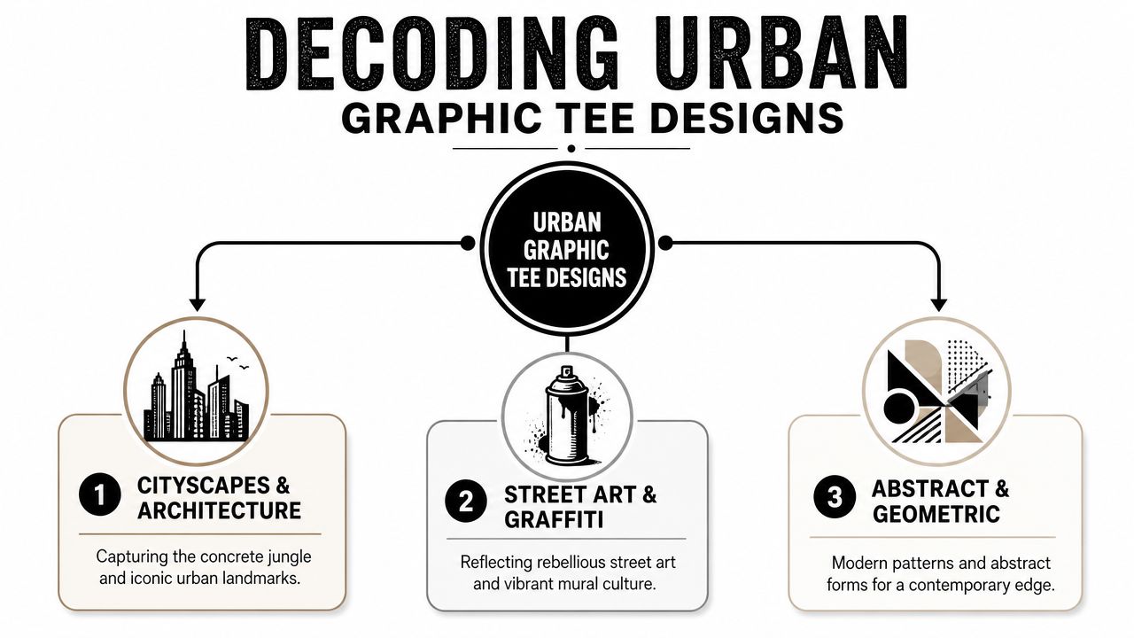
Music graphics as memory
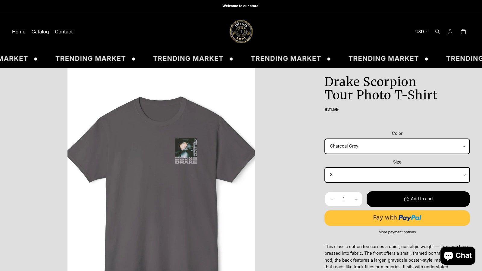
Music tees hit differently because they often carry a timestamp. A design like a Drake Scorpion Tour photo tee isn't only about the artist. It can be about a season of your life, a concert era, a playlist phase, or the visual language of that moment. Tour imagery, grainy photos, back print dates, and washed black cotton all make a shirt feel archival even when it's new.
That's why music graphics rarely need overstyling. They already come with emotional context.
A few signs a music tee works:
- The image has atmosphere: Tour shots, monochrome portraits, distressed treatment.
- The text placement feels intentional: Front chest hit, oversized back print, or restrained type.
- The mood matches your wardrobe: Darker palettes and faded finishes usually style easier than loud, glossy prints.
A strong music tee feels like you've had it longer than you actually have.
Automotive prints as taste markers
Car graphics have their own language. A BMW E36 print says something different from a generic racing shirt. Same with a GT-R Skyline graphic. These references tell people you're into form, mechanics, legacy, and a very specific visual world. Automotive tees often land best when the design doesn't scream merch. Clean line art, blueprint-style layouts, side-profile illustrations, and restrained text tend to age better.
There's also a difference between liking cars and liking car culture aesthetics. Urban graphic tees let you tap into either one. You can be the person who knows chassis codes, or the person who just likes the stance, the silhouette, and the feeling.
City motifs and the geography of style
City graphics are less about literal tourism and more about association. A Brooklyn New York motif can mean pride, aspiration, or attraction to a harder-edged urban look. City-based designs work because place carries attitude. Fonts, skyline references, borough names, transit-inspired marks, and block lettering all pull from the visual language of real streets.
Here's how different motifs tend to read:
| Theme | What it signals | Styling energy |
|---|---|---|
| Music | Memory, fandom, cultural timing | Washed denim, cargos, layered outerwear |
| Automotive | Precision, niche taste, speed culture | Technical jackets, relaxed pants, cleaner sneakers |
| City | Place, identity, urban pride | Caps, workwear shapes, everyday street fits |
The best choice usually isn't the loudest design. It's the one that already matches your interests, your rotation, and the version of yourself you want people to read.
Fabric and Fit The Foundation of a Great Tee
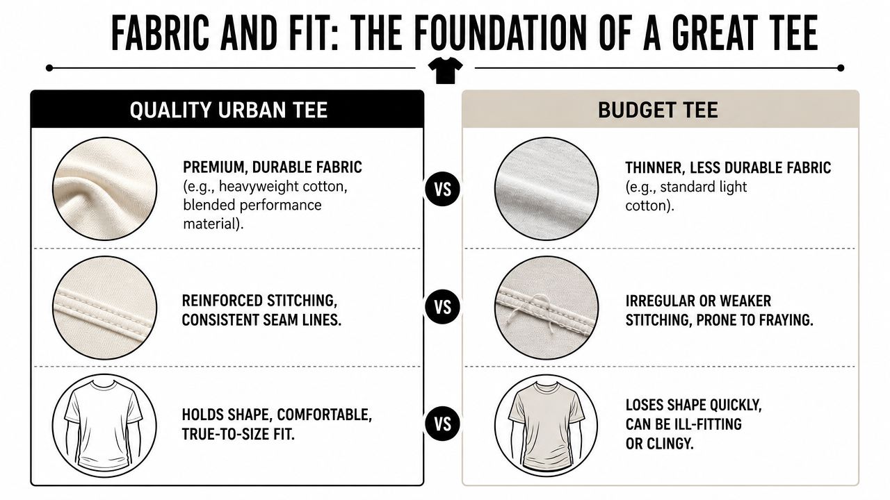
You feel the difference the second you pull a good tee off the rack. The graphic might catch your eye first, but fabric and cut decide whether the shirt becomes part of your weekly rotation or ends up stretched out in a drawer after three washes. In the $20 to $40 range, that distinction matters. Budget streetwear can still look strong, but only if the blank, print, and fit are working together.
What fabric weight changes
A lot of that premium feel comes down to GSM, or grams per square meter. In its guide to streetwear graphic tee specifications, Groove Color notes that many brands aiming for a structured streetwear silhouette use 280 to 320 GSM cotton, and that screen prints can outlast DTG prints over repeated washing. That helps explain why some tees keep their shape and presence while others start looking tired fast.
Weight changes the mood of the shirt too. A heavier tee gives graphics more authority. It stands off the body, holds a boxier shape, and makes even a simple front print feel more deliberate. A lighter tee hangs closer, feels cooler in heat, and usually reads more casual.
Neither is automatically better. The right choice depends on how you want the shirt to wear.
- Lighter tees feel softer and easier in warm weather, but they are more likely to cling, twist, or lose structure over time.
- Heavier tees hold shape better and usually frame large graphics well, but they can feel hot and stiff if the cut is off.
- Washed heavyweight cotton often hits the best middle ground for streetwear. It has body, but it does not feel like armor.
Print methods and what survives wear
The fastest way a budget tee starts looking cheap is through the print. Cracking ink, fading blacks, and collars that ripple after a few washes will ruin a strong design. According to Virtue Market Research on graphic designed T-shirt durability, 68% of streetwear buyers report frequent tearing or print fading within 6 months on lower-quality tees. That lines up with what shows up in real closets.
For buyers shopping on a budget, print method matters as much as artwork. Screen printing usually has better long-term durability and a more solid hand feel. DTG can reproduce detailed images well, especially photo-heavy graphics, but it often does not age the same way. If a brand is selling a detailed tee for under $30, it is worth checking whether the print is built for repeat wear or just for the product shot.
A good rule is simple. If the graphic is the whole point, the print needs to survive the life of the shirt.
In the $20 to $40 lane, “premium” is the wrong question. Ask whether the fabric weight, print method, and fit make sense for how often you plan to wear it.
A quick quality check before you buy
You do not need to inspect a tee like a factory rep. You just need to catch the weak points before you spend money.
-
Check the collar
A strong rib collar should sit flat and look dense in photos. If the neckline already looks loose, it usually gets worse fast. -
Read the fit description with skepticism
“Oversized” can mean boxy with dropped shoulders, or it can mean a standard tee sized up. Look at sleeve width, body length, and where the shoulder seam falls. -
Study the print surface
Glossy, plastic-looking ink can cheapen a design unless that finish is intentional. Softer prints and well-done distressing usually age better visually. -
Look for fabric density
Smooth, compact cotton tends to carry graphics better than thin jersey that starts pilling early.
The best urban graphic tees do more than show taste. They hold their shape, keep the print readable, and still feel right six months later. That is what separates a good buy from a shirt that only looked good on the screen.
How to Style Your Urban Graphic Tee
A graphic tee can carry an outfit by itself if the rest of the look gives it space. That's the mistake people make. They add too many competing ideas, then blame the shirt. Start cleaner.
The standalone statement
Take a bold photo tee, something in the lane of a tour graphic or a star-heavy front print, and let it be the lead. Pair it with straight-leg black denim or washed cargos. Keep the sneakers simple. The point is contrast. The shirt carries the emotional charge, while the rest of the fit stays grounded.
This formula works because it doesn't argue with the graphic. If the design already has texture, text, and image depth, you don't need louder pants or extra accessories fighting for attention.
A clean version looks like this:
- Top: Washed graphic tee with room in the chest and sleeves
- Bottom: Dark denim or muted cargos
- Footwear: Low-profile sneakers or sturdy skate silhouettes
The layered look
Layering gives urban graphic tees more range. A tee under an open quarter-zip, overshirt, or light jacket creates a controlled flash of personality. You're not hiding the graphic. You're framing it. This works especially well with automotive tees and city motifs because the peek of print feels deliberate, not overcommitted.
The trick is proportion. If the outer layer is roomy, the tee should still have enough weight to keep its shape underneath. Thin shirts bunch and disappear. Structured tees hold their lane.
Here's a quick visual reference for styling energy in motion.
Styling note: Layering works best when each piece has a different job. The outer layer sets silhouette. The tee supplies identity.
The casual weekend uniform
This is the easiest one to repeat. Start with a graphic tee that feels relaxed rather than precious. Add loose shorts or easy-fit pants, then finish with a trucker cap or compact crossbody if that matches your usual style. City-based graphics shine here because they feel natural in off-duty outfits.
The weekend version shouldn't look overbuilt. It should feel like the shirt has been in your life for a while. A Brooklyn-style cap, faded tee, and clean sneakers already give you enough signal.
If you want one rule that improves almost every graphic-tee outfit, it's this: match the mood, not the color. A gritty monochrome tee doesn't need exact color coordination. It needs pieces with the same attitude.
Shopping Smart Sizing, Care, and Gifting on a Budget
A budget tee stops being a deal the second the fit is off or the print cracks after two washes. In the $20 to $40 range, the smart buy is the shirt that still looks right after a month of regular wear, not the one that only wins on price.
Choosing the silhouette you want
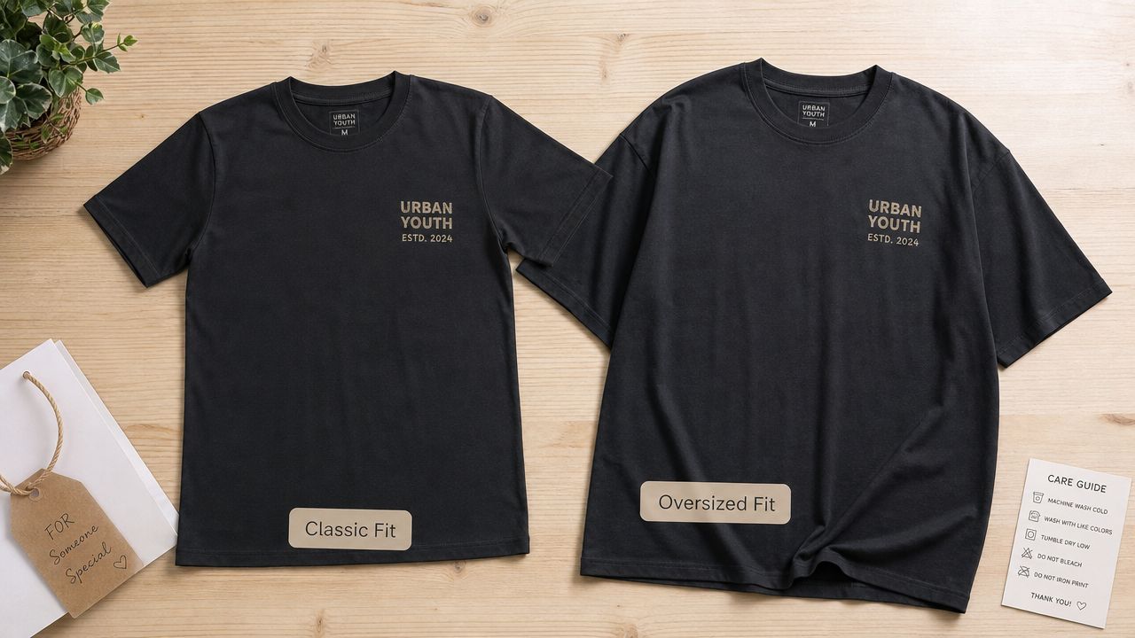
Disappointment often starts with a mismatch between the fit in your head and the fit that shows up at the door. Someone wants a roomy streetwear shape but orders a standard blank in their usual size. Someone wants a cleaner line and buys a boxy tee with dropped shoulders. Same category, very different result.
Use this quick distinction:
| Fit type | What it usually looks like | Best for |
|---|---|---|
| Classic fit | Straighter body, cleaner shoulder, less volume | Daily wear, light layering, a neater profile |
| Oversized fit | Dropped shoulder, wider body, roomier sleeve | Graphic-first outfits, heavier streetwear styling |
Product copy can be loose with terms like "relaxed" or "oversized." The better clue is the cut itself. Check the shoulder seam, body width, and sleeve length in the photos. If a brand only shows the front view and skips measurements, there is a reason to be careful.
Price matters here too. At this tier, a good tee usually gets one thing especially right. The graphic, the fabric weight, or the fit. Finding one that balances all three is what makes a budget pickup feel like a keeper.
Care habits that keep a tee alive longer
Urban graphic tees earn their place through repetition. They get thrown on for errands, late nights, concerts, and quick weekend plans. That kind of wear exposes weak cotton fast and punishes cheap prints even faster, so care is part of the value equation.
A few habits make a visible difference:
- Wash inside out: This cuts down friction on the print surface.
- Use cooler water: Lower heat is easier on both cotton fibers and ink.
- Skip aggressive drying: High dryer heat is what ages many graphics early.
- Don't over-wash: If the tee only picked up light wear, airing it out can buy another use.
- Fold heavier shirts: Thick cotton often holds its shape better folded than hanging.
One good care habit can stretch a budget tee far beyond its price tag.
Why graphic tees make easy gifts
Graphic tees gift well because the theme does half the work. If the person is into rap, go with a music reference that feels specific. If cars are their thing, choose a design with a real point of view instead of a generic speed graphic. If they rep a city hard, a place-based tee usually feels personal without trying too hard.
The budget range helps. A $20 to $40 tee can feel thoughtful without turning the gift into a sizing gamble with a bigger price tag. The safest move is to buy slightly roomy unless you know their exact preference, because a relaxed tee has more styling options than one that fits too tight. Add a cap or small accessory if you want, but one well-picked shirt is often enough to feel considered.
Wear Your Story The Last Word on Urban Tees
The best urban graphic tees do more than fill space in a drawer. They hold references. A sound you came up on. A car shape you always stop to look at. A city name that means home, or the idea of home. That's why some tees get worn into rotation immediately while others never feel right, even if the print looked good on screen.
Style matters, but construction matters too. A strong graphic on weak fabric won't stay convincing for long. A durable tee with the wrong mood won't feel like you. The sweet spot is when identity and build quality meet. That's the shirt you keep reaching for.
Urban graphic tees work best when they feel lived in, specific, and honest. Not overthought. Not costume. Just aligned. If a design fits your taste, the fabric holds up, and the cut works with the rest of your wardrobe, you've found more than a basic. You've found a piece of your own visual language.
If you're ready to find one that fits your style and budget, browse the curated graphic tees, caps, and accessories at Trending Market. The collection leans into music, automotive, and city-driven streetwear themes, with approachable pricing that makes it easier to build a rotation instead of chasing one-off impulse buys.