

You're probably looking at two tees right now that cost about the same. One feels promising, has a graphic you'd wear, and seems like an easy add to cart. The other might even have better photos. But you already know how this can go. One shirt becomes the one you keep reaching for until it softens, fades evenly, and starts to look better with age. The other turns into a stiff, twisted rag after a few washes, with a cracked print and a collar that gave up early.
That difference usually isn't luck. It comes from fabric choice, print method, and construction details that most product pages either hide or blur into marketing language. A lot of shoppers get told to “buy heavyweight cotton” and stop there. That's not enough, especially in the budget streetwear range where the actual difference often comes from how the graphic was printed and whether the maker is transparent about how the shirt was built.
Table of Contents
- Why Some Graphic Tees Become Legends and Others Do Not
- The Feel of Quality Decoding Fabric and Weight
- The Soul of the Shirt Print Techniques and Durability
- Built Different Construction That Signals Longevity
- Finding Your Fit The Guide to Modern Tee Silhouettes
- Keeping It Fresh How to Care for Your Graphic Tees
- Conclusion Becoming a Smarter Streetwear Collector
Why Some Graphic Tees Become Legends and Others Do Not
You've likely owned both versions. There's the old favorite with a faded band print, washed-out black cotton, and a collar that still sits right. Then there's the newer tee that looked sharp on day one but started peeling at the graphic, twisting at the body, and losing shape before it ever felt broken in.
That split matters because graphic tees aren't some tiny niche anymore. The global graphic tee market reached $47.3 billion in 2026, with 9.2% year-over-year growth, which tells you buyers aren't treating them like throwaway filler. They're a core streetwear category, and people are clearly willing to chase better pre-printed pieces when they find them.
The difference starts before the first wash
Price alone doesn't sort the good from the bad. A cheap tee can survive if the fabric, print, and sewing were chosen well. A pricier one can still fail if the brand spent more on branding than on the blank and the finishing.
What separates a future vintage piece from a forgettable tee is usually a stack of small decisions:
- Fabric quality: Better cotton feels cleaner in the hand and gives the shirt a better fall on body.
- Print choice: The wrong print can crack, peel, or sit on the shirt like a plastic patch.
- Construction: Weak seams and stretched collars kill a tee faster than fading ever will.
A great graphic tee doesn't just survive wear. It picks up character without falling apart.
Aging well is not the same as staying new
That's where many buyers get tripped up. Quality graphic tees aren't supposed to look untouched forever. Good ones age in a way that still looks intentional. The print softens instead of breaking apart. The cotton relaxes instead of collapsing. The shape stays recognizable.
A bad tee usually tells on itself early. The body torques after washing. The graphic turns brittle. The neckline starts waving. Once you know what causes those problems, product pages become easier to read, and bad buys become easier to skip.
The Feel of Quality Decoding Fabric and Weight
The fabric is the foundation. If the cotton is wrong, the rest of the shirt has to fight uphill. Even a strong graphic can't save a tee that feels flimsy, clings oddly, or loses its shape after a few wears.
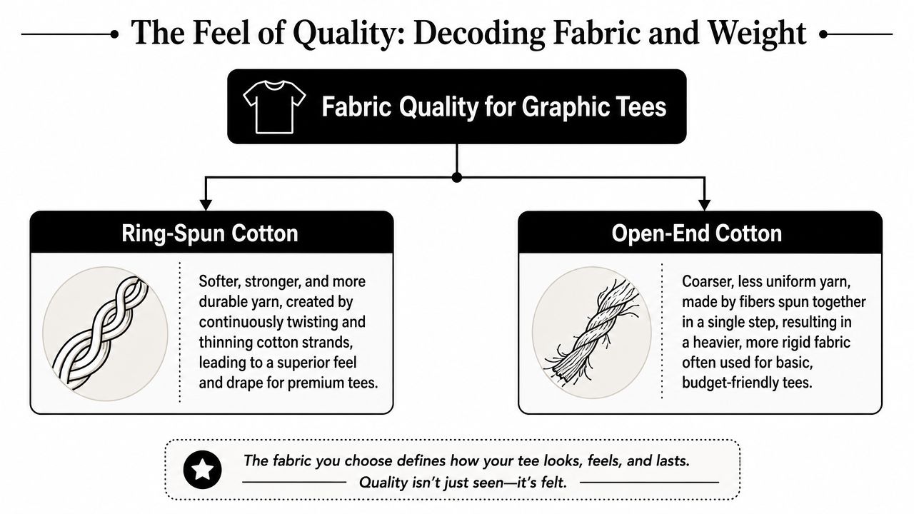
For daily streetwear, the best baseline is 100% ring-spun cotton in the 5.3 to 6.1 oz range, or about 180 to 206 GSM. That range gives you breathability, a solid drape, and enough structure to support a graphic without feeling stiff.
Start with the cotton itself
Ring-spun cotton is the phrase worth looking for. It matters because the yarn is made to be smoother and more uniform than open-end cotton. In plain terms, that usually means a softer hand feel, a cleaner surface, and a better base for print.
Visualize the difference between a rough sketchpad and a smoother sheet of paper. A smoother surface gives the graphic a better shot at looking crisp and staying intact. It also helps the shirt feel better against skin over time.
Open-end cotton isn't automatically trash. Some sturdy blanks use it well. But in the budget market, it often shows up in tees that feel rougher, bulkier in the wrong way, and less refined through the body and sleeves.
Weight changes the whole personality of a tee
Weight isn't just about thickness. It changes how a tee hangs, how it frames the graphic, and how it layers under outerwear.
A quick way to read fabric weight in practice:
| Fabric feel | What it usually gives you |
|---|---|
| Lighter side of midweight | Easier breathability, more casual drape |
| Middle of the recommended range | Best balance for everyday wear |
| Heavier side | More structure, stronger streetwear shape |
If you like a tee that sits close and moves easily, the lower end of that ring-spun range tends to feel more natural. If you want a boxier look with a little more body, the upper end usually works better.
Practical rule: Don't confuse heavy with premium. A shirt can feel thick and still wear badly if the yarn is rough or the cut is off.
A lot of shoppers chase the heaviest shirt they can find. That's useful only if the silhouette calls for it. For everyday quality graphic tees, too much weight can turn a wearable shirt into something stiff, hot, and awkward. The best tees feel substantial without feeling armored.
The Soul of the Shirt Print Techniques and Durability
The graphic is why you bought the tee. It's also where many budget shirts fail first. At this point, the usual advice breaks down, because “screen print is better” isn't always true once you get into the lower end of the market.
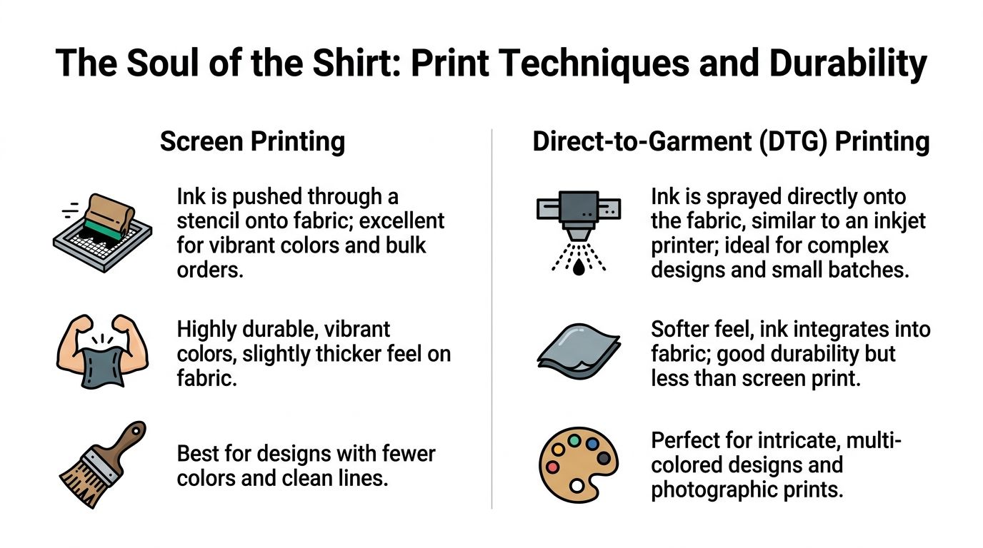
In the $20 to $40 range, high-quality DTG on heavyweight cotton often outlasts low-cost screen prints, which can crack after 10 to 15 washes. That matters because a lot of buyers still assume screen printing automatically means premium. It doesn't.
Why cheap screen print disappoints
A good screen print can be excellent. It can be bold, saturated, and durable. But cheap screen printing often cuts corners in ways you can feel immediately.
Watch for these red flags:
- Thick plastic feel: If the graphic sits on top like a hard slab, the print may crack instead of flexing with the shirt.
- No movement in the print area: Hold the fabric lightly. If the printed section feels rigid compared to the rest of the shirt, aging may get ugly fast.
- Large solid areas with a glossy finish: That can look sharp at first, but budget prints with heavy coverage often break unevenly.
The problem isn't the screen method itself. The problem is low-cost execution. Thin or poorly laid ink can fail early, and overbuilt prints can feel suffocating on body.
When DTG is the smarter buy
DTG, or direct-to-garment, gets underrated because older examples taught people to expect weak color or fast fade. Better DTG on the right cotton is a different story. The ink integrates into the fabric more naturally, which usually gives the print a softer hand and better flexibility.
That's why a strong DTG tee in this price band can be the smarter long-term buy. It often wears more like part of the shirt instead of a layer glued onto it.
A simple way to compare them in hand:
| Print type | What to check |
|---|---|
| Screen print | Feel for flexibility, not stiffness |
| DTG | Look for clean detail and even integration into the fabric |
If you're deciding between a cheaper “premium screen print” label and a slightly pricier DTG tee on solid cotton, trust your fingers more than the marketing.
The best outcome is simple. The print should bend with the fabric, not fight it. If the design looks good but feels brittle on day one, it won't get better later.
Built Different Construction That Signals Longevity
Fabric and print get the attention. Construction decides whether the shirt can carry both for the long haul. This is the part most shoppers skip, even though the signs are usually visible in product photos or obvious the second the shirt lands in hand.
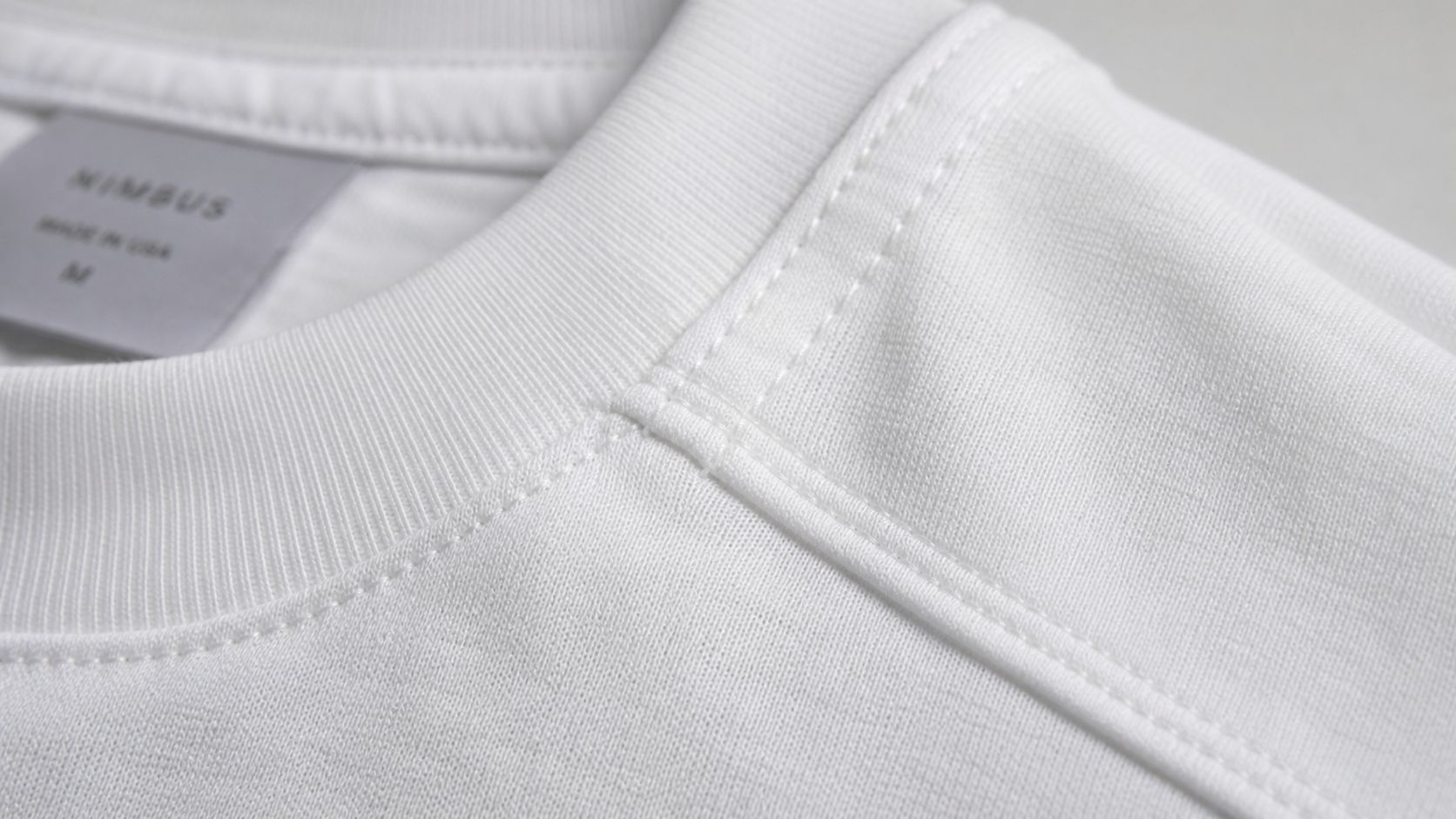
A lot of the quality clues sit in boring places. Collar. shoulder seam. hem. side seam. Those details aren't glamorous, but they tell you whether the maker cared about the shirt as a garment or just as a surface for artwork.
Where to inspect first
Start with the collar. A good rib collar should spring back instead of staying stretched. If the neckline already looks wavy in photos, expect it to get worse.
Then check these points:
- Shoulder area: Taping helps the shirt keep its line and limits stretching.
- Hem stitching: Clean, even stitching is a good sign. Messy, loose finishing isn't.
- Side seams: Twisting and puckering usually signal weaker assembly or poor fabric handling.
A quality tee feels composed. Nothing about it looks rushed. The sleeves sit correctly, the hem lies flat, and the whole shirt looks balanced even before it's worn.
Ethics shows up in the stitching
Next, the conversation gets more interesting. Ethical production isn't separate from quality. In budget streetwear, it's often one of the clearest signs of it.
According to this streetwear quality guide, 68% of Gen Z shoppers prioritize ethical production, and 42% of budget tees from undisclosed factories show seam unraveling within 6 months. That pairing makes sense. Brands that hide where and how they make tees often hide the construction standard too.
Look for transparency cues instead of vague claims:
- Country of manufacture is stated clearly
- Certifications or material standards are named plainly
- Product pages show close-ups of seams, collar, or fabric
- Care and material details are specific, not padded with buzzwords
Ethical transparency isn't a bonus feature. It often signals that the brand is willing to be judged on the parts that usually reveal quality problems.
If a brand tells you nothing beyond the graphic and the fit name, be cautious. Good makers usually don't mind showing their work.
Finding Your Fit The Guide to Modern Tee Silhouettes
A perfect tee with the wrong fit still ends up unworn. Streetwear has made that even more obvious because silhouette does so much of the styling now. The same graphic can look sharp on a boxy cut, lazy on a too-long body, or strangely tight if the sleeves and chest are fighting the print.
The easiest fix is to stop guessing sizes and start measuring one shirt you already love. That removes most of the drama from online shopping.
Use your best tee as the reference
Lay your favorite tee flat and measure the parts that affect how it wears:
- Chest width: Armpit to armpit.
- Body length: Top of shoulder down to hem.
- Shoulder width: Seam to seam across the top.
- Sleeve length: Shoulder seam to sleeve end.
Then compare those numbers to the size chart, not just the label. A medium in one brand can wear like a large in another, especially with oversized cuts.
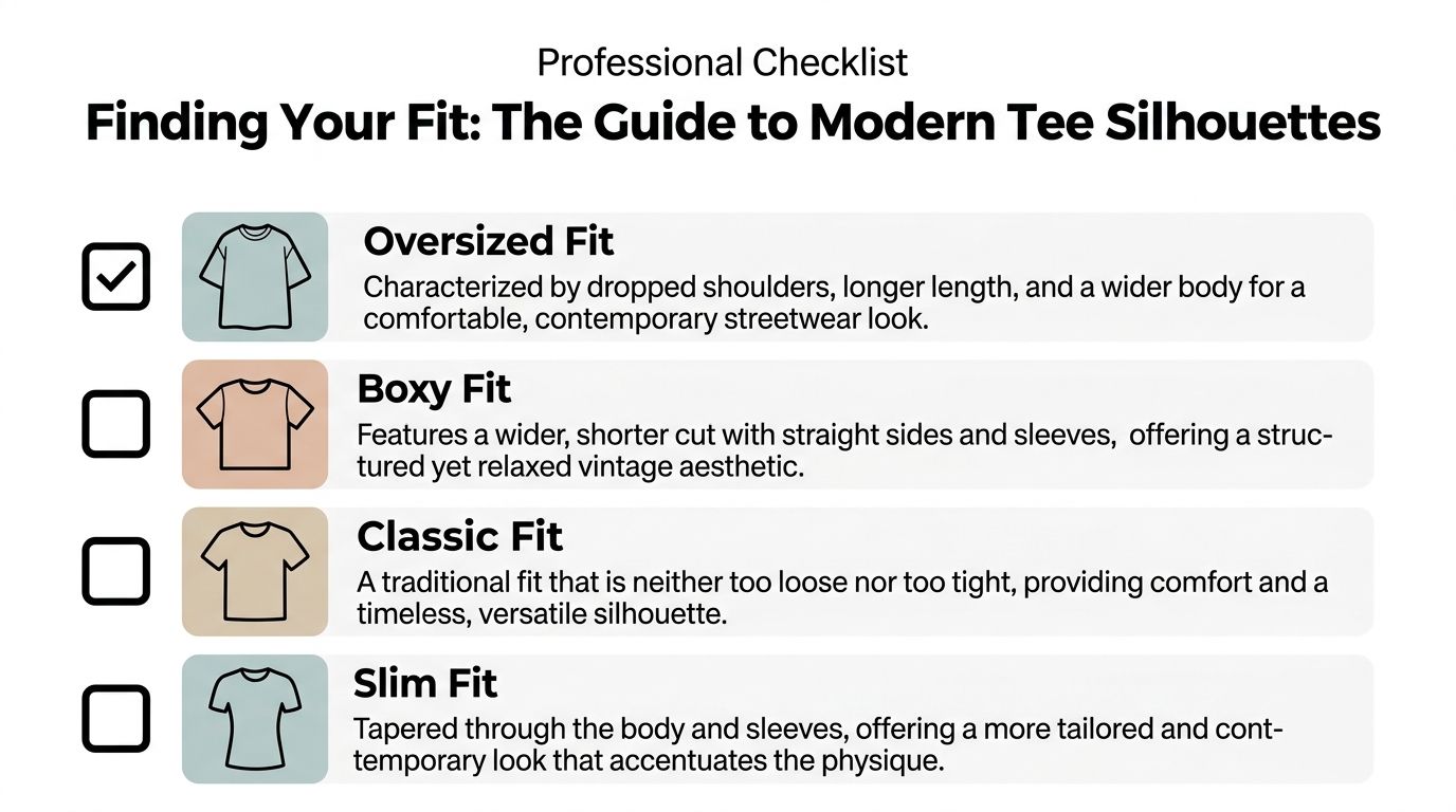
A quick visual guide can help before you compare measurements:
What each silhouette actually does
Classic fit is the easiest all-rounder. It follows the body without squeezing it and works if you want the graphic to do most of the talking.
Boxy fit usually has a wider body and a shorter, more squared-off shape. This is great for vintage-style graphics and heavier cotton because the shirt holds a frame.
Oversized fit pushes further with more width, more drop at the shoulder, and often more length. It works best when the fabric has enough substance to stop the shirt from looking limp.
Slim fit is the least forgiving for graphic tees. It can work with smaller prints or cleaner designs, but large front graphics often feel crowded on a narrow frame.
Pre-shrunk cotton helps here because it lowers the risk of the fit changing after the first wash. Even then, smart buyers still leave a little room, especially if the shirt is all cotton.
Keeping It Fresh How to Care for Your Graphic Tees
A good tee can still die from bad laundry habits. Most print damage people blame on quality starts with heat, friction, and rough handling.
The goal isn't to baby your shirts. It's to avoid the two things that age them badly. Excess heat and unnecessary abrasion.
What to do
Keep the routine simple:
- Wash inside out: That protects the graphic from rubbing against other garments.
- Use cold water: It's easier on both cotton and print.
- Choose a gentler cycle: Less agitation helps the shirt keep its shape.
- Fold instead of hanging heavy tees: That helps collars keep their structure.
If a shirt has a print you really want to preserve, wash it with similar fabrics. Rough items can scrape the surface of the graphic over time.
What to avoid
A few habits wreck quality graphic tees faster than people realize:
- High heat drying: This is hard on print and cotton at the same time.
- Ironing directly on the graphic: That can damage or distort the print surface.
- Overstuffed loads: More rubbing, more stress, more twisting.
- Hanging wet shirts by the collar: That's an easy way to stretch the neckline.
Treat the graphic like part of the garment, not a sticker that can take punishment.
The tees that age best usually belong to people with boring laundry habits. Cold wash, low stress, no heat abuse.
Conclusion Becoming a Smarter Streetwear Collector
Buying better graphic tees isn't about becoming obsessive. It's about learning which details matter. The shirt should feel right in the hand, the print should move with the fabric, and the stitching should look stable in all the places that carry stress.
That's the checklist. Fabric. Print. Construction. Fit. If those four line up, a tee has a chance to become one of the pieces you keep for years instead of one season.
A smart collector doesn't get distracted by the loudest product page. They read the cotton specs, question the print method, inspect the collar, and pay attention when a brand is transparent about production. That's how you separate a shirt that only looks good online from one that still looks good after real wear.
Quality graphic tees don't have to be rare. But they do reward attention.
If you want to put that checklist to work, browse Trending Market's streetwear graphic tees and accessories and compare each piece the way a smarter collector would: check the fabric feel, study the print style, and choose designs you'll still want to wear once the novelty is gone.