
You're probably looking at a dozen New York tees right now and feeling the familiar friction. One shirt says “NYC” in a stock font, another leans hard into tourist-shop energy, and a third looks promising until the graphic feels disconnected from any real place. The problem isn't finding a New York graphic tee. It's finding one that feels like it belongs to the city instead of borrowing the name.
The best version of this shirt doesn't work because it says New York. It works because it signals a story. Sometimes that story is downtown grit, sometimes it's outer-borough pride, sometimes it's a clean archival nod to old city iconography. The difference shows up in the graphic language, the fabric, the fit, and the way you style it.
Table of Contents
- The Enduring Appeal of the New York Graphic Tee
- Decoding the DNA of a New York Streetwear Tee
- Spotting Quality Fabric and Printing
- Mastering the Modern Streetwear Fit
- How to Style Your New York Graphic Tee
- A Smart Buyer's Guide to Graphic Tees
The Enduring Appeal of the New York Graphic Tee
A real New York graphic tee does something a generic souvenir can't. It carries attitude before you even build the outfit around it. You can throw it on with faded denim and beat-up sneakers, and if the design is right, the shirt already says enough.
That's why this category never really disappears. People aren't just buying a city name. They're buying an idea of New York that feels sharp, restless, creative, and a little confrontational in the best way. Some want the skyline. Some want a reference that only people from a certain neighborhood clock immediately. Some want that old-school streetwear tension where the tee feels casual but loaded with identity.
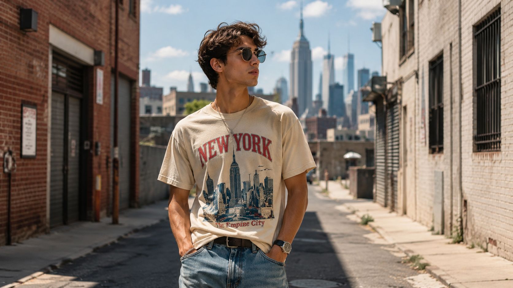
The shirt also sits in a sweet spot that few pieces hit. It's approachable, wearable, and expressive without asking for too much. A jacket can feel like a commitment. A statement sneaker can dominate the whole fit. A New York tee can anchor the look while still leaving room for your jeans, cap, chain, or outer layer to do their part.
A strong city tee feels lived in, even when it's brand new. A weak one feels like it was made for a gift shop rack.
The appeal comes down to this. The best New York graphic tees don't flatten the city into a slogan. They give you a cleaner way to wear its energy.
Decoding the DNA of a New York Streetwear Tee
Why this shirt still matters
You see it fast on the street. A black tee, strong type, maybe a borough name or a washed photo print, and it reads differently from standard tourist merch before you even get close. The good ones carry history without looking stuck in it.
One reason is the category's long visual memory. The image that still gets referenced is John Lennon in 1974, wearing a black and white “New York City” shirt on the roof of his Manhattan penthouse, a moment described in Simply Stick's history of graphic tees as a defining link between the city motif and global pop culture. That photo pushed the shirt past souvenir status. It gave the New York tee a place in the wider graphic tee canon.
That history explains why the category still has weight. Designers do not need to overwork the message. A single line of type can hit if the reference feels grounded and the execution feels true to the city.
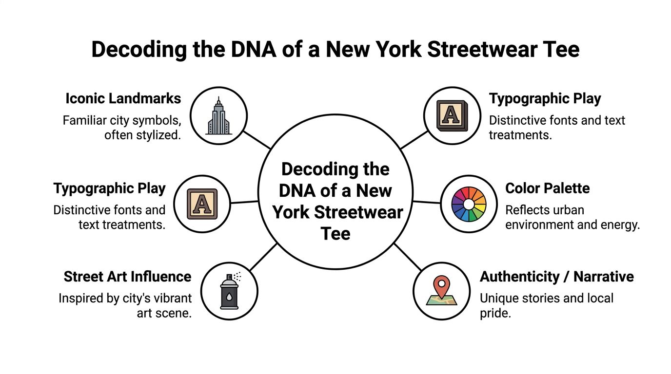
The visual codes worth reading
The first question is simple. Which New York is the shirt talking about?
The strongest designs usually fall into a few clear lanes, and each one has its own risk if the brand misses the tone.
| Design lane | What it signals | What often goes wrong |
|---|---|---|
| Landmark driven | Architectural pride, postcard imagery reworked for fashion | Feels too polished or too touristy |
| Typography led | Confidence, restraint, streetwear credibility | Uses generic fonts with no city character |
| Neighborhood specific | Local pride, insider energy, sharper identity | Name-dropping without any visual point of view |
| Music and art coded | Downtown history, scene references, cultural memory | Becomes cluttered and over-designed |
Typography is usually the first giveaway. New York graphic language has tension to it. Block capitals, transit-board spacing, stacked compositions, vintage gym lettering, stark black-and-white palettes, and slightly distressed treatment all make sense here. Script fonts, glossy effects, and random color fades usually kill the mood because they feel detached from the city's actual visual texture.
Hyperlocal detail is where a tee starts to feel real. Existing coverage of this category often stays at the city-name level, but neighborhood-level pride, from Bushwick to Astoria, has been noted as a self-expression trend in this discussion of graphic tee trends. In practice, that means the better shirts get specific. Brooklyn instead of NYC. Queens instead of Manhattan. A train line, a corner store reference, a venue nod, a local phrase, a street grid.
That specificity is the difference between costume and character.
Practical rule: If the design could swap “New York” for any other city and still make sense, it probably isn't saying much.
I usually look for signs that the designer understands how New York gets seen. Borough references. Old athletic department typography. Flyer and zine energy. Monochrome photo treatment. Graphics that feel a little raw, like they were pulled from a wheatpasted poster or a downtown record sleeve. The shirt does not need to shout. It needs a point of view, and it needs to know exactly where it comes from.
Spotting Quality Fabric and Printing
Fabric that holds up
A good graphic can still die on bad fabric. This problem often tricks many buyers, especially online, because the product photo sells the image but tells you very little about how the shirt will wear after a few washes.
For premium streetwear-leaning tees, one reliable spec is a 60% cotton / 40% polyester blend at 4.2 oz/yd², which Into The AM's graphic tee guide describes as a balance between durability and the heavier feel many shoppers want. The same source notes that this composition can keep shrinkage below 3% while helping detailed graphics resist cracking or fading better than many all-cotton alternatives.
That doesn't mean 100% cotton is bad. It means there's a trade-off. Cotton usually gives you a more natural hand feel and that broken-in softness people love. Blends often hold shape better, move through repeated washing with less drama, and give prints a more stable base.
Print quality you can judge fast
Most shoppers don't need a printing masterclass. They need a quick filter.
Start with the edges of the graphic. Crisp lines usually signal better control. Muddy outlines, weak contrast, and artwork that looks slightly blurred in product photos usually age badly. If the graphic is photo-based, check whether the darks have depth or just collapse into a flat patch.
Then look at placement. New York graphics usually look strongest when the scale feels intentional. A tiny chest hit can work if the typography is excellent. A large front print can work if the composition breathes. What doesn't work is awkward in-between sizing that makes the art look like an afterthought.
Use this checklist when you're shopping online or in person:
- Read the fabric blend: If the listing hides composition details, that's a bad sign.
- Check the weight language: Terms like lightweight, midweight, or heavyweight affect drape and how premium the tee feels.
- Zoom the print: Look for sharp edges, even ink coverage, and artwork that doesn't seem overcompressed.
- Study the collar: A flimsy collar can make the whole shirt feel cheap, even if the graphic is good.
- Watch for distortion: If the print stretches strangely across the chest in photos, the base blank may not be great.
Better tees age into character. Cheap tees age into apology.
Care that keeps the graphic sharp
Even a solid tee can get cooked by bad laundry habits. Heat is usually the enemy. High-heat drying can stress the print, warp the body, and flatten the life out of the shirt.
A simple routine works best:
- Wash inside out to protect the graphic surface.
- Use cold water when possible.
- Skip harsh drying cycles and let the tee air dry if you want to preserve shape.
- Avoid ironing directly over the print unless you're using a protective layer.
Streetwear looks better when it relaxes naturally. You want the shirt to soften over time, not break down.
Mastering the Modern Streetwear Fit
Fit is where a New York graphic tee either clicks or misses. The design can be excellent, but if the shirt hangs wrong, the whole look loses tension. In streetwear, silhouette is part of the graphic.
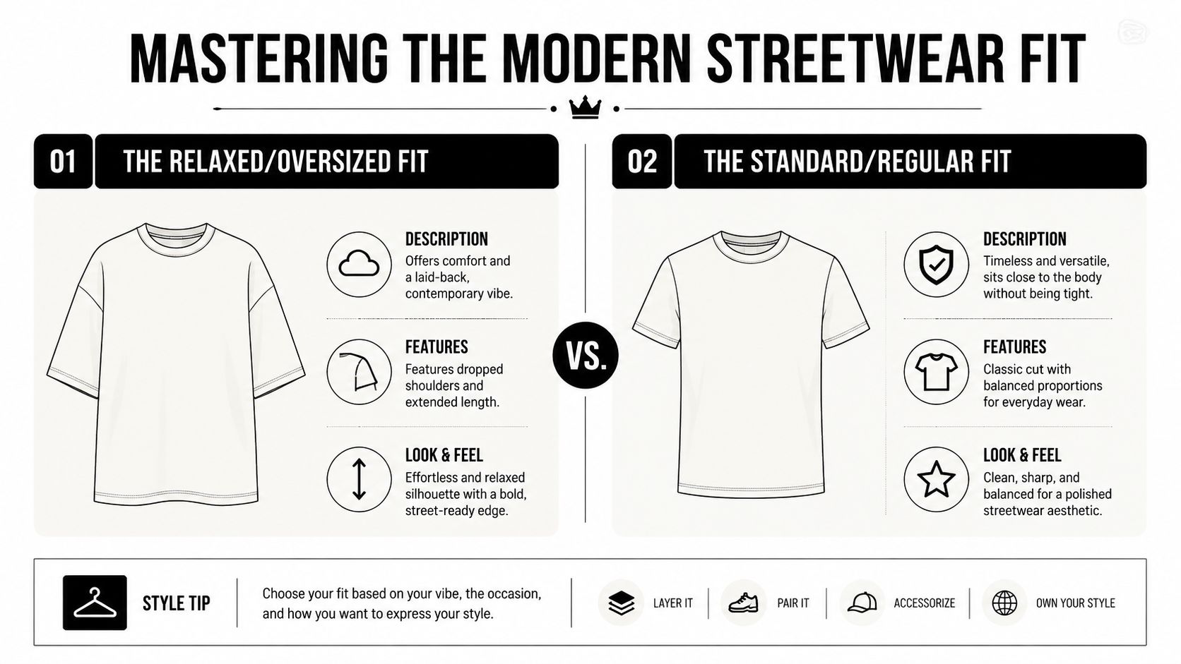
Regular fit versus oversized
A regular fit works when you want the tee to play cleanly with the rest of the outfit. It sits closer to the body without looking tight, and it usually pairs best with straight denim, relaxed chinos, or shorts that already have enough volume. If the graphic is loud, regular fit can help contain it.
An oversized fit changes the mood immediately. Dropped shoulders, more room through the sleeves, and a boxier body make the shirt feel current and effortless. This is the fit people reach for when they want the tee to act like the centerpiece rather than a supporting layer.
A simple way to decide:
- Choose regular fit if your style leans classic, neat, or low-key.
- Go oversized if you like stacked layers, wider pants, and a looser silhouette.
- Pick boxy cuts when you want shape without extra length.
How stretch changes the feel
Some tees include elastane or spandex, and that changes how the shirt moves on body. Under the FTC's textile labeling guidance, blends that include elastane can provide 5% to 10% mechanical stretch, a detail noted in the FTC overview of textile and wool labeling requirements. In practical terms, that extra give can help a comfort-fit tee move better without pulling hard across the graphic area.
That kind of stretch can be useful if you hate that stiff, restrictive feeling some budget tees have. It can also help if you want a closer fit without the shirt looking strained through the chest or shoulders.
The right fit doesn't just flatter your frame. It tells the graphic how to behave.
There's one more thing worth checking. Labels matter. Fiber content and country of origin should be permanently attached. If a brand gets vague about materials, don't assume the tee will feel better in person than it does on the product page.
How to Style Your New York Graphic Tee
Styling this piece gets easier once you stop treating it like a novelty shirt. A good New York graphic tee should operate like a foundation piece, the same way a strong hoodie or dependable pair of washed denim does.
Here's one accessory pairing that instantly pushes the look in the right direction.
Look one downtown minimal
Take a black or washed charcoal New York tee with a restrained front graphic. Pair it with relaxed black jeans and low-profile sneakers. Add a cropped bomber or a clean work jacket if the weather needs a layer.
This look works because the shirt carries the identity while everything else stays disciplined. You're not trying to make every piece shout. The tee gets the spotlight, and the rest of the outfit frames it.
Keep accessories lean:
- Cap choice: Simple trucker or tonal fitted cap
- Jewelry: One chain or ring is enough
- Footwear: Classic sneakers with a worn-in feel, not something too futuristic
Look two borough pride
This is where hyperlocal design really hits. A tee that references Brooklyn, Queens, Astoria, Bushwick, or another specific area has more personality than another generic “NYC” print. That kind of shirt gives the outfit a point of view.
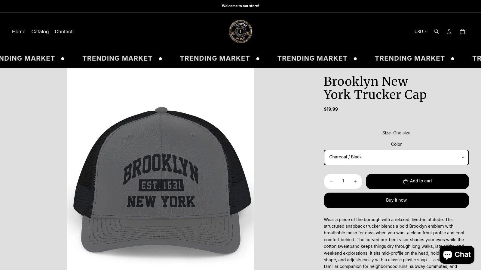
Pair a neighborhood-specific tee with faded blue denim or olive cargos, then add a trucker cap with a city callout. If you want a cap that stays on theme without overcomplicating the look, the Brooklyn New York trucker cap at Trending Market is the kind of accessory pairing that makes sense with a borough-driven graphic.
The key is not to stack too many references from different worlds. If the tee says Queens and the hat says Brooklyn and the jacket references a different city entirely, the fit starts arguing with itself.
Hyperlocal tees usually feel strongest when the outfit around them stays simple and lets the place name carry emotional weight.
For a little movement and styling inspiration, this visual breaks down the energy of the look well.
Look three layered and graphic heavy
If your tee has a larger front print, maybe a photo treatment, bold type stack, or collage effect, treat it like the anchor of a layered fit. Start with wider-leg pants or loose cargos. Then throw on an open overshirt, denim jacket, or quarter-zip that doesn't cover the entire graphic.
This works best when the colors speak to each other. A black-and-white shirt with washed denim, grey cargos, and a muted outer layer usually lands better than a fit with too many competing tones. New York graphics often look strongest in monochrome, off-white, faded navy, ash grey, or deep black because those shades match the city's harder visual texture.
A quick styling matrix helps:
| Tee style | Best bottom | Best layer |
|---|---|---|
| Minimal type tee | Straight or relaxed denim | Bomber or work jacket |
| Neighborhood graphic | Cargos or washed jeans | Trucker cap and light overshirt |
| Large front print | Wide-leg pants | Open denim jacket or zip layer |
The easiest mistake is over-styling. If the shirt already has strong typography, don't bury it under loud patterns, glossy accessories, and oversized branding everywhere else. Let one piece talk first.
A Smart Buyer's Guide to Graphic Tees
A crowded market makes buyers lazy. That's when people start choosing from thumbnails instead of details, and that's how they end up with shirts that look decent online but disappoint the second they're in hand.
That's worth resisting because graphic design shirts, including city motifs like New York, held the largest revenue share in the custom t-shirt printing industry in 2024, and the broader global t-shirt market was valued at $30.68 billion in 2026, with growth projections continuing according to Printful's t-shirt industry statistics roundup. In plain terms, there are a lot of options, and that scale creates both great finds and a lot of forgettable product.
What to check before you buy
Use a short buyer's filter before you hit checkout.
- Read the composition first: Fabric blend tells you more than a styled photo does.
- Check the fit language: Regular, oversized, relaxed, and boxy are not interchangeable.
- Look for permanent label transparency: Fiber content and origin details matter, especially if a brand hints at premium or ethical positioning.
- Study the graphic concept: Ask whether the design says something specific or just fills space.
- Match price to information: In the entry-level range, you should still expect clarity on materials, fit, and visuals.
If a shirt sits in the $20 to $40 lane, you're usually shopping for value, not museum-level construction. That's fine. But value still needs honesty. You should know what the shirt is made of, how it fits, and what kind of graphic you're paying for.
Red flags that kill the vibe
Some problems show up before the package ever arrives.
- Vague descriptions: If the listing hides fabric details, move on.
- Generic artwork: If the shirt looks like it was built from clip art and stock fonts, it probably feels that way too.
- No fit context: A single flat product image tells you very little about drape.
- Forced sustainability language: If a tee makes eco claims with no meaningful material detail, treat that carefully.
The smartest buy is rarely the loudest one. It's the one that gets the fundamentals right and gives you a graphic with enough identity to keep wearing it long after the first outfit.
If you want a budget-friendly place to browse city-driven streetwear pieces, caps, and graphic basics without digging through an endless catalog, check out Trending Market. The store keeps its focus tight, which makes it easier to build a look around a New York graphic tee instead of getting lost in filler.