

When shopping for a quote tee, you likely do what many others do. You scroll, pause on a design for two seconds, then ask the same quiet question every time. Does this feel like me, or does it just look trendy right now?
That's the whole game with graphic tees quotes. The right one doesn't just fill space on cotton. It tells people what scene you move through, what references you catch, and whether your style leans sharp, nostalgic, loud, or stripped back. A clean one-word print gives a different energy than a fake tour back hit. A city name lands differently than a car code. And if the placement is wrong, even a strong quote can look cheap fast.
That matters because graphic design shirts still lead the custom T-shirt printing space, and the broader market was valued at $5.16 billion in 2024 with a projection to reach $9.82 billion by 2030. Pre-printed graphics dominate because people want instant expression through logos, imagery, slogans, and recognizable cultural references, not always fully custom artwork.
This guide cuts past generic quote lists and gets into what works in streetwear. Not just the words, but the vibe, placement, typography, and styling choices that make a tee feel intentional.
Table of Contents
- 1. Minimalist Single-Word Statements
- 2. Music Culture and Tour References
- 3. Automotive and Car Culture References
- 4. City and Geographic Location Pride
- 5. Retro and Vintage Aesthetic Quotes
- 6. Inspirational and Motivational Quotes
- 7. Humor and Ironic Commentary Quotes
- 8. Graphic Novel and Comic Book References
- 9. Social Commentary and Activism Quotes
- 10. Gaming and Esports Culture References
- Top 10 Graphic Tee Quote Categories
- From Quote to Closet Making Your Tee Stand Out
1. Minimalist Single-Word Statements
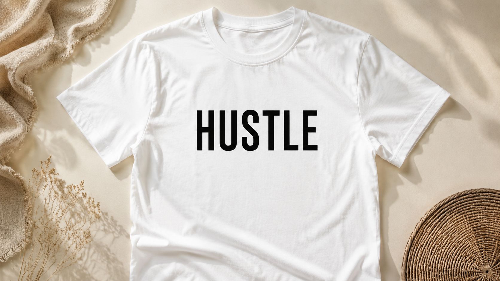
A single word can hit harder than a full sentence if it carries the right weight. “HUSTLE,” “VIBES,” “GRIND,” “DRIFT,” “BASS,” and “STREETS” work because they read like identity tags, not filler copy. In streetwear, that directness feels clean and self-assured.
This category lives or dies on typography. A weak font turns a strong word into gym merch. A sharp sans serif, condensed block type, or slightly distressed vintage letterform gives the word attitude before anyone even reads it.
Why minimal wins
Minimal quote tees work best when the blank space is part of the design. A small centered word on a fitted tee can feel timid, but the same word blown up across the chest or dropped slightly off-center on an oversized tee feels editorial.
What doesn't work is indecision. Don't pair a tiny one-word quote with random clip art, extra flourishes, and three different font styles. That kills the whole point.
- Choose a word with subculture weight: “DRIFT” speaks to car culture. “BASS” leans music. “LOCAL” or “UPTOWN” hints at place and scene.
- Match the font to the mood: Heavy gothic fonts feel darker. Rounded sans serif feels softer and more contemporary.
- Think about contrast first: Cream ink on a faded black tee often looks richer than stark white on pure black.
Practical rule: If the word can't carry the whole shirt by itself, it's not the right word for a minimalist tee.
A lot of brands chase complexity when they should trust restraint. The best minimalist graphic tees quotes feel like they were designed by someone confident enough to leave space alone.
2. Music Culture and Tour References
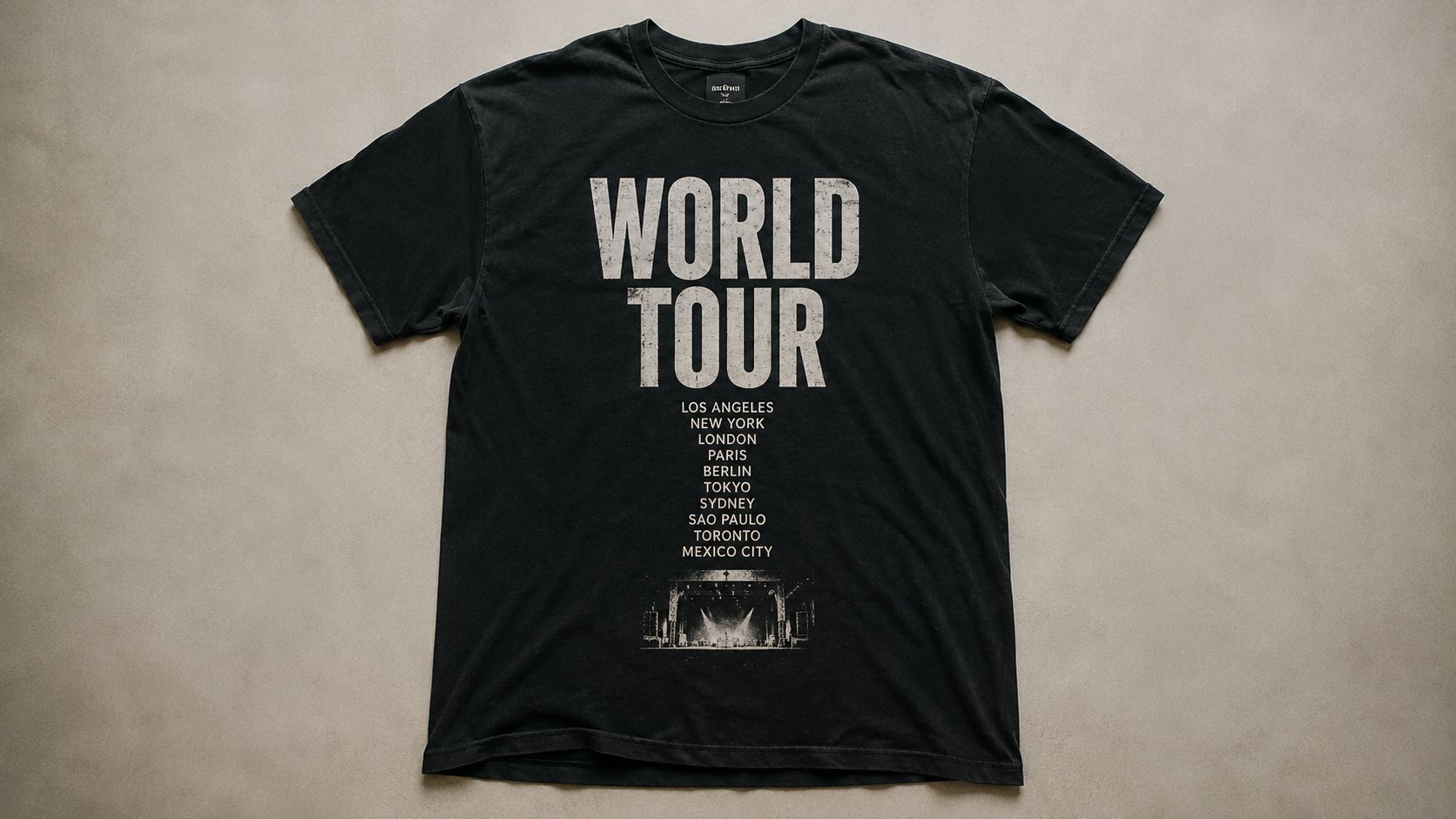
Music quotes and tour references are some of the strongest pieces in the whole streetwear world because they come with built-in memory. A world tour back print, an album-era phrase, or a city run list instantly frames the tee as more than apparel. It feels collectible.
That's why pieces like a Drake Scorpion Tour-inspired shirt land so well. Even when the design is simple, the cultural association does the heavy lifting. The wearer isn't just showing taste. They're showing era, mood, and allegiance.
How to make a tour-style quote feel legit
Tour-inspired tees need visual hierarchy. The main phrase should hit first. The date line, city list, or supporting text should reward the second look. That layered read is what gives the shirt depth.
A lot of cheap versions fail because they overstuff the layout. Too many tour stops, too much distressing, or artist imagery that fights the text. Better to keep one hero phrase and let the rest support it.
Tour graphics should feel lived-in, not overcrowded.
There's also a longevity question with music references. Some phrases hold because they tie back to established artists, album eras, or recurring fan culture. That's a safer lane than chasing disposable internet slang. The gap in most shopping advice is quote longevity versus trend volatility, especially for references tied to recognizable culture rather than one-season jokes, as noted in Pinterest search behavior around quote-on-back shirt inspiration.
For styling, this category works best with washed denim, cargos, or layered flannels. Let the tee be the loudest thing in the outfit. It already carries enough story.
3. Automotive and Car Culture References
Car culture tees hit different when they're made for people who know the platform. “BMW E36” means something specific. “GT-R Skyline” does too. These aren't random graphics. They signal taste, era, engineering obsession, and late-night parking lot energy.
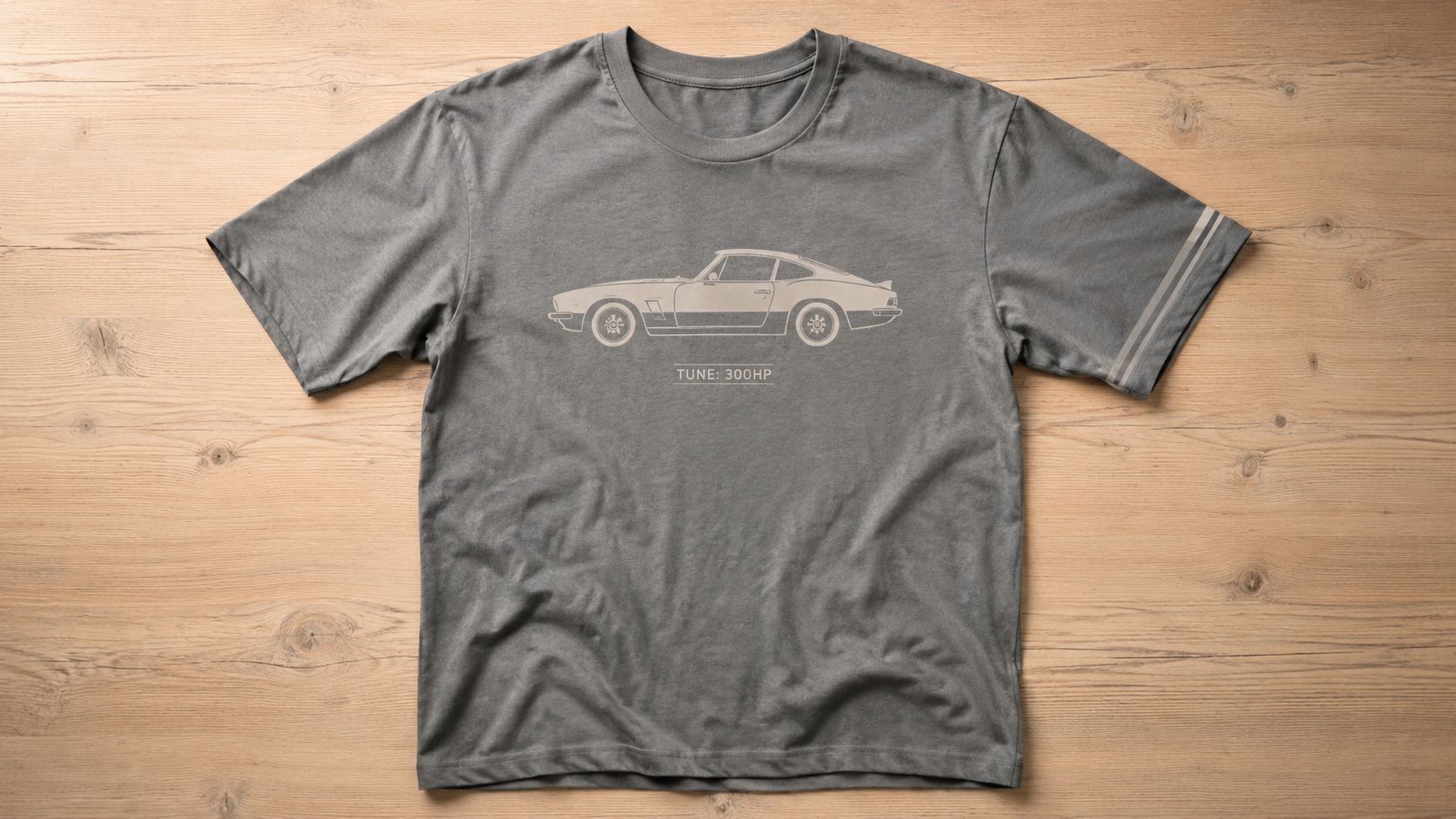
A good automotive quote tee should feel tuned, not generic. Engine-code language, chassis references, or subtle performance phrasing often lands harder than broad “speed” slogans because the right audience catches it instantly.
The difference between car-inspired and car-correct
The fastest way to lose credibility is getting the details wrong. Wrong generation. Wrong silhouette. Wrong trim cues. Car people notice everything, and they won't forgive lazy visuals just because the shirt color is nice.
That's why a model-specific reference works so well in streetwear. A BMW E36 graphic or Skyline-inspired top creates immediate recognition without needing a paragraph of explanation. The quote or label becomes shorthand for the whole lifestyle around the car.
- Use model names carefully: If the shirt says E36, the visual language should support that reference.
- Keep performance talk subtle: A small “tuned,” “boosted,” or chassis code detail can feel sharper than a giant horsepower statement.
- Let the machine shape the layout: Angular cars suit rigid type. Rounded classics can handle softer curves or retro scripts.
Placement that suits the machine energy
Automotive graphics often look better with a larger back print than a small chest hit. A front-left logo can work, but a back graphic gives room for the silhouette, quote, and secondary details to breathe.
For oversized tees, placement matters even more. Standard quote-print advice often ignores how these garments drape. On oversized cuts, standard chest prints can shift off-center because of fabric curvature, and print areas need to scale up to keep the design from looking lost. The practical placement guidance in oversized custom T-shirt design notes from TShirtEnvy is useful here, especially around back prints, asymmetric placement, and scaling artwork for larger sizes.
Use that logic on car tees and they stop looking like basic merch. They start looking considered.
A moving visual works especially well for this lane.
4. City and Geographic Location Pride
Late train, black jeans, beat-up sneakers, one clean tee. A strong city graphic finishes that outfit fast because it gives the look a point of view. The right place name does more than mark a map. It signals where your taste sits, what scenes you notice, and what kind of energy you want the fit to carry.
That is why this category works best when the reference feels specific. City pride on a graphic tee should read like cultural shorthand, not tourist merch. “Brooklyn New York” works because it already lives inside streetwear, music, hoops, skate, and downtown retail language. You do not need a long phrase if the location already carries weight.
Typography decides the mood. Block collegiate text pushes it toward heritage sportswear. Condensed all-caps sans serif feels sharper and more current. A script treatment can pull the same city into nightlife, old deli signage, or throwback club-flyer territory. The trade-off is clarity. The more stylized the lettering gets, the more the city name needs room to stay readable.
Local detail gives these shirts credibility. Borough names, area codes, transit references, cross streets, airport codes, and neighborhood shorthand usually hit harder than generic skyline art. A cap like the Brooklyn New York trucker cap from the Trending Market collection works for that reason. The design keeps the message clean and lets the location carry the identity.
If a location graphic could swap “Brooklyn” for any other city and still feel the same, the design is too broad.
Placement matters here in a different way than music or auto tees. A centered chest print keeps the city name direct and wearable. A small left-chest hit with a larger back location mark feels more insider and less souvenir shop. For oversized fits, wider letter spacing and slightly lower placement usually sit better on body, especially when the shirt is meant to layer under an open overshirt or work jacket.
Styling is straightforward. City tees pair well with loose denim, fatigues, track pants, or a clean cap that repeats the same place reference. Keep the rest of the outfit grounded so the location reads like identity, not costume.
The misses are easy to spot. Fake slang. Random coordinates. Stock skyline silhouettes. Any graphic that treats the city like a cliché loses the room. Geographic pride works when the design respects the place and gives it the right visual language.
5. Retro and Vintage Aesthetic Quotes
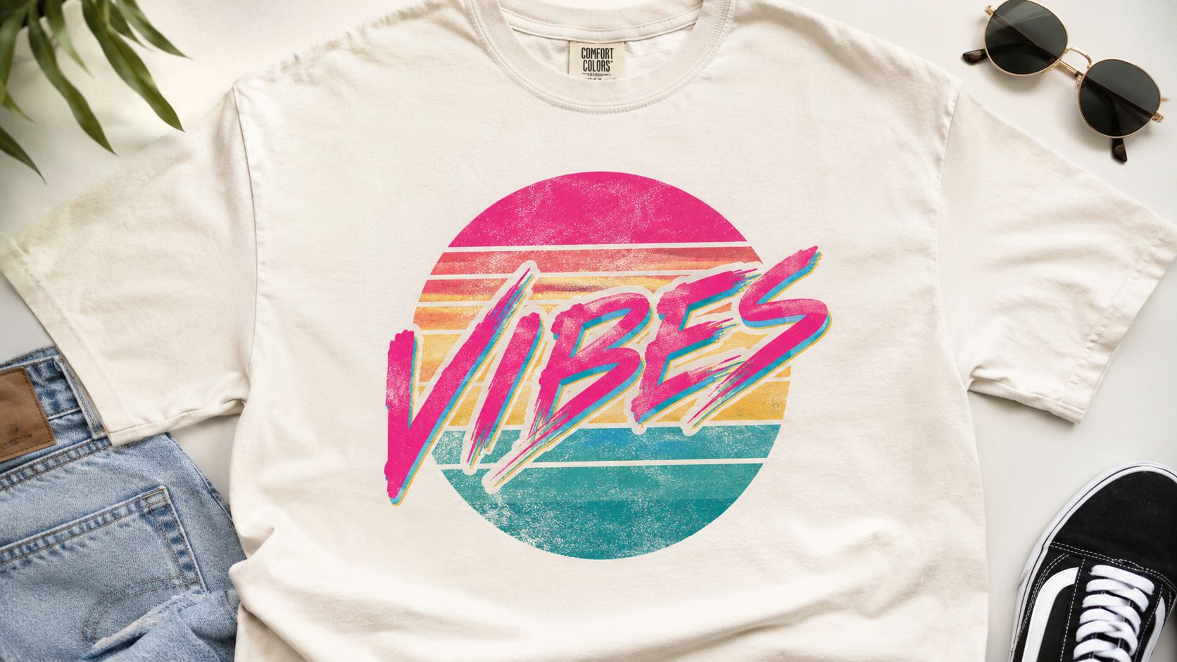
Retro quote tees aren't only about nostalgia. They're about texture, color memory, and attitude. A word like “VIBES” can feel forgettable in a modern default font, then suddenly feel perfect when it's paired with a faded sunset palette, soft distressing, and an old-school layout.
That's why retro and vintage graphics keep cycling back. They let a simple phrase carry emotional residue. It feels borrowed from a better era, even when the shirt is brand new.
Aged without looking fake
The key is balance. If every part of the design screams “vintage,” it can tip into costume. Better to use one or two strong retro cues, then keep the rest clean. Maybe the font feels late-80s, but the spacing is modern. Maybe the print is faded, but the tee blank has a fresh oversized cut.
Products like Vintage Lips and 8-Ball style graphics work because they tap into visual memory fast. You don't need a long quote. You need a phrase or motif that feels like it survived from another rack, another city, another night.
- Use fewer colors well: Muted creams, faded reds, dusty blues, and washed black usually age better than hyper-saturated neons.
- Distress with restraint: Light wear simulation adds character. Heavy fake cracking can make a new shirt look forced.
- Pair retro with modern fit: Boxier silhouettes stop the design from feeling like thrift-store cosplay.
Retro graphic tees quotes are strongest when they feel discovered, not manufactured to death.
6. Inspirational and Motivational Quotes
Motivational tees can go hard or go corny. There's not much middle ground. The difference is whether the phrase sounds lived-in or sounds like a stock wallpaper caption.
Shorter works better. “Keep Going.” “Built Different.” “Stay Focused.” “No Excuses.” Those phrases carry more weight in streetwear than long sermon lines because they leave room for attitude. The shirt should suggest discipline, not beg for approval.
Keep the message grounded
A motivational quote needs visual tension. If the message is positive but the design is too soft, it can lose edge. Strong block letters, darker garment colors, and restrained layouts help the phrase feel tougher and more wearable.
This lane also benefits from context. Motivation tied to movement, training, creative grind, or resilience feels natural on a tee. Generic positivity without any subcultural anchor usually fades fast.
Wear test: If the phrase feels awkward when you say it out loud, it'll probably feel awkward on a shirt too.
Styling matters here. A motivation-based tee looks better with workwear pants, sneakers, and outerwear that adds structure. Treated that way, it reads like conviction. Treated too softly, it can slide into mall-brand territory.
For graphic tees quotes in this category, confidence comes from editing. Fewer words. Better type. A cleaner hit.
7. Humor and Ironic Commentary Quotes
Funny quote tees work when the joke is quick, dry, and easy to clock from a few feet away. Nobody wants to read a whole paragraph on someone's chest. If the humor needs explanation, it's dead.
The best ironic shirts feel self-aware, not desperate. They sound like the wearer has taste and a sense of humor, not like they bought the first sarcastic slogan in a novelty aisle.
Funny ages fast when the design does too much
A sharp line in plain type can land harder than a loud joke wrapped in flames, arrows, and random icons. Humor already draws attention. The design doesn't need to yell over it.
There's also a trade-off here. Viral joke shirts can spike interest fast, but they date even faster. Dry observational lines or understated commentary usually wear longer because they're tied to personality, not platform trends.
- Go short: One-liners beat mini monologues.
- Avoid forced meme language: If the phrase sounds old in your notes app, it'll look older on fabric.
- Use contrast smartly: Deadpan black-on-white or tonal ink can make the joke feel cooler.
A good humorous tee should still look good when nobody's reading it. That's the standard a lot of joke shirts never reach.
8. Graphic Novel and Comic Book References
Comic-inspired quote tees work best when they borrow the visual force of the medium, not just the fandom. Bold ink lines, halftone textures, speech bubbles, action frames, and impact lettering all give the shirt movement before the words even register.
That's the sweet spot. You want the energy of a panel, not the stiffness of licensed sleepwear.
Make it graphic, not costume
The strongest comic-style tees usually do one of two things. They either focus on a single iconic line with high-impact typography, or they create an original graphic-novel mood with invented dialogue and scene framing. Both can work. The second route often feels fresher.
Streetwear loves this category when it stays dark, oversized, and art-led. Black blanks, washed tones, red accent ink, and asymmetrical panel placement can make a comic reference feel premium instead of juvenile.
Let the print feel cinematic. Too many speech bubbles and character faces can flatten the shirt into fan merch.
If you're building around a known character or famous line, rights matter. For commercial use, that's not optional. If you don't have permission, go original. Create your own world, your own phrase, your own illustrated tension.
That usually gives you a stronger shirt anyway.
9. Social Commentary and Activism Quotes
This category has real weight, which means bad design decisions show up even faster. A social statement tee can't rely on trend language or empty provocation. People can tell when the message is there for aesthetics and nothing else.
The best activism-oriented tees use concise wording and serious restraint. One line. One demand. One value. That gives the shirt clarity and keeps it from reading like a poster shrunk onto cotton.
Say less, mean more
Strong social commentary on a tee needs conviction in both wording and presentation. Clean type, deliberate spacing, and sober color choices usually outperform overly decorative layouts. The goal is presence, not clutter.
This is also one of the few categories where over-styling can undermine the point. If the visuals are too flashy, the shirt can look like it's exploiting the message rather than carrying it.
- Choose direct language: Short statements travel better in public space.
- Make sure the brand can stand behind it: If the message and the store ethos don't align, people feel that disconnect immediately.
- Avoid vague rebellion aesthetics: If the phrase could mean anything, it usually means nothing.
Social commentary tees can be powerful, but only when the design respects the seriousness of what it's saying.
10. Gaming and Esports Culture References
Gaming quote tees are strongest when they feel like an inside nod. Not every shirt needs a giant controller graphic or loud neon cyber font. Sometimes a ranked reference, lobby phrase, loading-screen line, or understated in-game language says more to the right people than obvious fan art ever could.
This lane is close to music and auto culture in one important way. Specificity wins. Generic “gamer” slogans usually feel disposable. But a phrase that mirrors actual community language feels wearable.
The best gaming tees feel insider, not merchy
Retro arcade references hold up well because they already have a visual legacy. Pixel type, old cabinet palettes, and tournament-style lockups can feel timeless if they're handled with restraint. Competitive gaming references can work too, but they need clean execution or they start looking like event freebies.
This category also benefits from oversized cuts and back-print layouts. Gaming phrases often look better as a larger rear hit with a small chest mark up front, especially when the design includes coded language or stylized UI-inspired details.
For styling, keep the outfit grounded. Loose cargos, dark denim, technical outerwear, and simple sneakers stop the tee from becoming costume. That balance is what keeps gaming graphic tees quotes in streetwear territory instead of novelty merch land.
Top 10 Graphic Tee Quote Categories
| Style | Implementation Complexity 🔄 | Resource Requirements ⚡ | Expected Outcomes ⭐📊 | Ideal Use Cases 💡 | Key Advantages ⭐ |
|---|---|---|---|---|---|
| Minimalist Single-Word Statements | Low, simple typography and layout | Low, single-color prints, minimal artwork | High visibility and broad appeal; steady baseline sales | Brand staples, budget-friendly drops, high-volume basics | Timeless, low-cost, highly scalable |
| Music Culture and Tour References | Medium–High, licensing and authenticity needed | Medium, rights, artist assets, timely production | Strong fan engagement and high perceived value; time-limited spikes | Tour/anniversary releases, fan-targeted campaigns | Emotional connection, collector appeal |
| Automotive and Car Culture References | Medium, technical accuracy and detailed art | Medium, specialist designers, possible brand clearances | High niche loyalty and repeat purchases | Car events, community collaborations, niche drops | Passionate audience, cross-over with gaming/fashion |
| City and Geographic Location Pride | Low–Medium, skyline/typography per locale | Low, scalable templates; many SKUs possible | Strong local engagement and good souvenir performance | Tourist markets, regional expansions, local drops | High regional relevance, easy to expand inventory |
| Retro and Vintage Aesthetic Quotes | Medium, era-accurate typography and textures | Low–Medium, color separations, specialty distressing | High social engagement; cyclical demand peaks | Trend-driven collections, nostalgia-led drops | Multi-generational appeal, strong visual hooks |
| Inspirational and Motivational Quotes | Low, typography and authentic messaging | Low, simple art, potential partnerships | Broad appeal and shareability; steady gift sales | Lifestyle branding, gifts, awareness collaborations | Universal resonance, high perceived value |
| Humor and Ironic Commentary Quotes | Low–Medium, concept testing recommended | Low, text-driven; user testing advisable | High shareability and viral potential; variable longevity | Social drops, influencer campaigns, novelty gifts | Memorable, builds distinctive voice |
| Graphic Novel and Comic Book References | High, licensing and detailed illustration work | High, IP clearance, artist fees, full-color printing | Strong built-in audience; tied to media cycles | Movie tie-ins, conventions, collector editions | Dedicated fandom, bold visual impact |
| Social Commentary and Activism Quotes | Medium, requires authenticity and research | Low–Medium, partnerships, donation logistics | Strong emotional engagement; reputational risk if inauthentic | Cause campaigns, mission-aligned drops, awareness drives | Deep values alignment, partnership opportunities |
| Gaming and Esports Culture References | Medium–High, licensing/trend sensitivity | Medium, streamer/team partnerships, assets | High engagement among gamers; rapid trend turnover | Esports events, streamer merch, limited drops | Large addressable market, strong community loyalty |
From Quote to Closet Making Your Tee Stand Out
Choosing the quote is the easy part. The harder part is making sure the shirt wears well in everyday use. A strong phrase can still die on the rack if the typography feels cheap, the placement is off, or the print method doesn't suit the design.
Start with typography. Font choice isn't decoration. It's tone. A one-word statement in a heavy condensed sans serif feels controlled and modern. The same word in a loose script can feel throwback, romantic, or soft. If you're working with music references, layered type and distressed lettering can add memory and texture. If you're building around a city name or motivational line, cleaner type usually gives the design a longer life.
Placement matters more than commonly understood. Regular-fit rules don't always transfer to oversized blanks. A quote that looks fine on a standard tee can feel stranded on a boxy silhouette. Bigger cuts usually need more print presence, better scaling, or a layout shift to the back. That's where many budget tees lose the plot. The quote isn't bad. The sizing logic is.
Print method should match the mood of the shirt. Crisp, sharp printing suits minimal phrases and modern designs. Slightly softer or more lived-in finishes suit retro graphics, tour references, and worn streetwear aesthetics. The print should support the story. If the design is meant to feel archival, a perfectly sterile finish can work against it.
The best graphic tees quotes also respect cultural shelf life. Some references age beautifully because they're tied to established worlds like music eras, car platforms, city pride, or long-running visual styles. Others burn bright and disappear. If you want a shirt you'll still wear next season, choose references with roots, not just reach.
Copyright is the other thing people skip until it becomes a problem. Lyrics, artist names, comic properties, game assets, famous slogans, and protected imagery all need proper rights if you're selling them. Inspiration is one thing. Commercial use is another. When in doubt, go original. A well-built shirt with an original phrase usually has more personality than a lazy borrowed quote anyway.
A standout tee feels coherent from every angle. The phrase matches the culture. The font matches the phrase. The placement matches the fit. The styling matches the energy. When all of that lines up, the tee doesn't just say something. It becomes part of how you move.
If you want streetwear pieces that already speak the right language, Trending Market is worth a look. The store leans into the categories that matter in this space, including music references, automotive graphics, city motifs, and everyday statement pieces that are easy to wear without overthinking the outfit. It's a strong stop for budget-conscious shoppers who want graphic-led style with recognizable cultural cues, whether you're picking up a tee, a cap, or a layered top that fits straight into a streetwear rotation.