

You're probably here because you've held two tees that looked equally good on a product page, then one arrived buttery soft while the other felt like the graphic was sitting on top like a sticker. That difference isn't random. A graphic tee doesn't just have a design. It has a build, a hand feel, a way it breathes, and a way it ages.
That's why graphic tees print matters so much. The print method shapes the vibe as much as the artwork does. A cracked, faded chest graphic can feel like lived-in vintage gold. A dense, bright logo can feel like tour merch, skate shop stock, or a brand staple made to take abuse. When you know what you're touching, you stop buying blindly.
There's a reason this category keeps growing. The global graphic tees market reached USD 31.8 billion in 2025 and is projected to reach USD 47.99 billion by 2031, with a 7.1% CAGR from 2026 to 2031, and printed graphic tees hold the largest share of that market because people keep coming back to visual, identity-driven casual wear, according to graphic tees market research from Deep Market Insights.
Table of Contents
- Why Your Favorite Graphic Tee Feels the Way It Does
- The Two Souls of a Print On the Fabric vs In the Fabric
- Screen Printing vs DTG The Streetwear Heavyweights
- Exploring Niche Prints Sublimation, Heat Transfer, and Discharge
- The Art of the Stitch Understanding Embroidered Graphics
- How Print Methods Shape Streetwear Trends
- Your Tee's Forever Guide Buying Smart and Making It Last
Why Your Favorite Graphic Tee Feels the Way It Does
Pick up a vintage-style band tee and run your fingers across the print. Maybe the image feels soft, almost sunken into the cotton. Then grab a bold streetwear logo tee with thick white ink and you'll feel the design immediately. One feels broken in. The other feels built up.
That feeling is the result of a deliberate production choice. Designers don't just choose artwork. They choose how that artwork should live on the shirt. If the goal is a loud front graphic with hard edges and deep opacity, the print method has to support that. If the goal is a faded automotive photo or a soft wash that feels like the shirt has been loved for years, the print method changes.
Feel is part of the design
A good tee works like a good sneaker material choice. Suede, mesh, and leather can all make the same silhouette feel different. Print methods do the same for apparel.
- Soft and integrated: Great for washed graphics, photographic art, and vintage-inspired pieces.
- Dense and tactile: Better for logos, bold iconography, and graphics that need to pop from a distance.
- Textured and raised: Useful when you want the application itself to feel premium or deliberate.
Practical rule: If you can describe the print before you describe the artwork, the print method is doing real design work.
Why buyers get confused
Most shoppers look at color and image first. That makes sense. But the wearing experience shows up later. You notice it when the tee gets warm, when the chest graphic bends, when it survives the wash, or when the print starts aging in a way you either love or regret.
That's the craft behind a strong graphic tees print. The best shirts don't just look right on day one. They wear into their identity.
The Two Souls of a Print On the Fabric vs In the Fabric
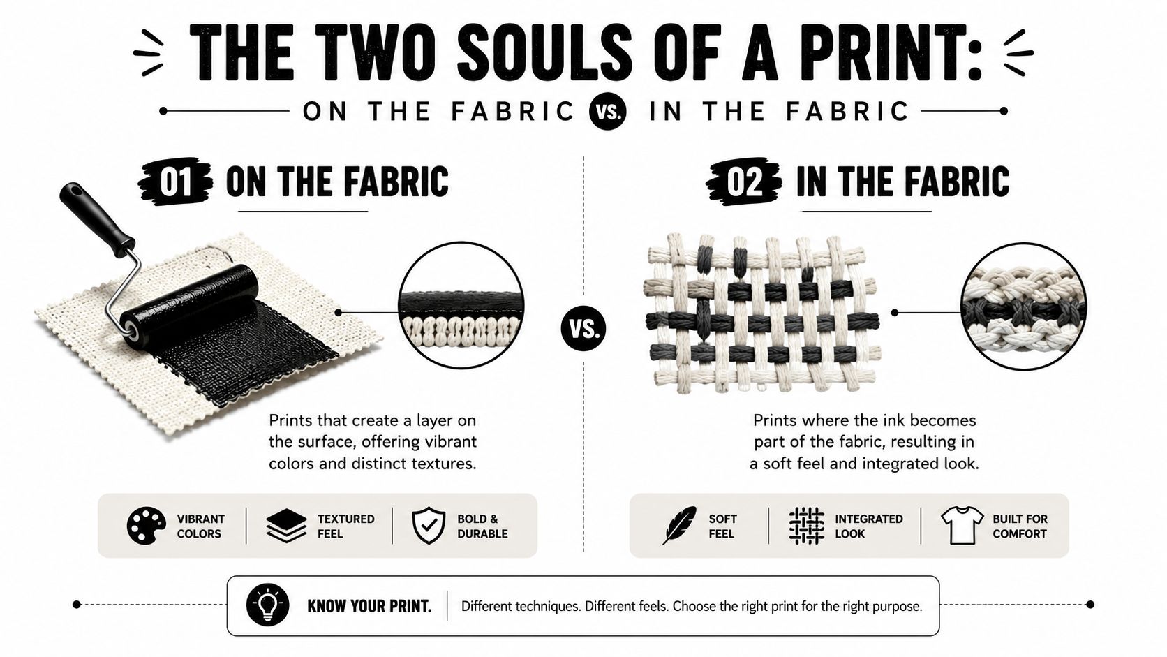
If you only remember one thing, remember this. Most tee graphics behave in one of two ways. They either sit on the fabric or they become part of the shirt in the fabric.
That one distinction explains almost everything people ask about: softness, breathability, shine, color punch, cracking, and fade pattern.
On the fabric
Think of this like paint on a wall. The ink forms a visible layer over the fibers. You can usually feel it with your fingertips.
That layer gives you strength in certain directions. Colors often look bolder. Edges can look cleaner. The print can feel more substantial, which is great when the shirt is supposed to have presence. A heavy logo print, a blocky chest hit, or a tour-style front graphic often benefits from this surface effect.
The trade-off is simple. Because the design lives on top, you're more likely to notice the graphic as a separate material.
In the fabric
This is closer to staining wood. The image doesn't feel like an added shell. It feels absorbed, merged, quieter.
That usually means a softer hand and a more breathable result. The shirt drapes more naturally because the print isn't creating as much of a barrier. This is the lane for faded portraits, subtle gradients, and graphics that are supposed to feel lived in rather than loud.
A shirt can look graphic-heavy and still feel soft if the ink goes into the fibers instead of resting above them.
A fast way to judge a tee
Use this quick test when you're shopping in person.
| What you notice | Likely print behavior | What that usually means |
|---|---|---|
| You feel a raised layer | On the fabric | Bolder look, more tactile surface |
| The graphic feels almost flush | In the fabric | Softer hand, easier drape |
| The print reflects light slightly | On the fabric | More visible ink layer |
| The graphic feels like part of the shirt | In the fabric | More natural wear feel |
Once you see tee printing this way, the technical side gets a lot less intimidating. You're not memorizing machines. You're learning how the artwork physically lives on cotton or polyester.
Screen Printing vs DTG The Streetwear Heavyweights
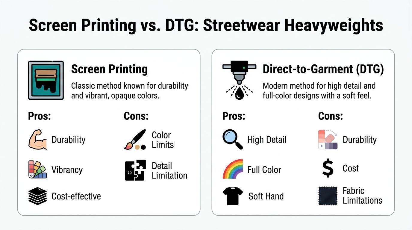
These are the two methods commonly compared, and for good reason. In streetwear, they shape a huge chunk of what you see on racks and product pages. They can both make a good tee. They just tell different stories.
How screen printing behaves
Screen printing is the old workhorse. Ink gets pushed through a mesh stencil, and each color needs its own screen. That process creates layers of plastisol or water-based ink on the garment, which is why screen prints often feel thick, vibrant, and built to last. It also means the method wants vector artwork, usually AI or EPS, with outlined fonts and Pantone references, because the design has to be separated by color for production, as explained in Reuterings' breakdown of graphic tee printing methods.
For streetwear, this matters a lot. A screen-printed logo has authority. White ink can sit boldly on black cotton. Red, yellow, and blue can hit with that poster-like clarity people associate with skate graphics, merch tables, and classic brand tees.
The hand feel is part of the point. If you want the print to announce itself, screen printing helps.
Best fits for screen printing
- Bold logos: Think chest hits, back graphics, and graphics with hard color separation.
- Brand consistency: Pantone matching matters when a label wants the same red on every drop.
- Bulk runs: This method has setup logic that makes sense for repeatable, solid-color designs.
Screen printing is less like watercolor and more like laying down confident blocks of color with intent.
How DTG behaves
DTG stands for direct-to-garment. It prints with water-based inkjet technology directly into cotton fibers, which gives it a softer finish than methods that leave a more obvious surface layer. It's especially strong for full-color art, photographic detail, and fine gradients, but it needs clean files. The standard file requirement is 300 DPI with a transparent background, and a 12 × 16 inch chest print needs 3,600 × 4,800 pixels to hold detail properly, according to Ink & PXL's explanation of t-shirt printing methods.
That file detail isn't trivia. It's the difference between a moody portrait looking intentional and looking mushy. If you've ever seen a tee with a washed sunset, a detailed car photo, or subtle tonal blending, DTG is often the better candidate.
The big style advantage is softness. A DTG print can keep the tee breathable because the ink absorbs into the cotton rather than forming the same kind of top layer you'd get from heavier surface printing.
Best fits for DTG
- Photographic prints: Tour-photo graphics, collage art, painterly imagery.
- Complex color shifts: Smoke, sky, skin tone, chrome reflections, soft fades.
- Vintage-style softness: When you want the print to feel less separate from the shirt.
Screen Print vs. DTG At a Glance
| Attribute | Screen Printing | Direct-to-Garment (DTG) |
|---|---|---|
| Print feel | Tactile and more layered | Softer and more absorbed |
| Visual strength | Bold, opaque, high-impact solids | Detailed, nuanced, gradient-friendly |
| Artwork type | Vector-based art with color separation | High-resolution full-color raster art |
| File needs | AI or EPS, outlined fonts, Pantone references | 300 DPI, transparent background, large enough pixel dimensions |
| Best aesthetic | Tour merch, logos, punchy street graphics | Photo tees, faded art, subtle tonal work |
| Wear character | Feels like a deliberate print layer | Feels closer to the fabric itself |
Which one should you choose
If the design is a statement logo, a back print with a few strong colors, or something you want to feel classic and assertive, screen printing usually makes more sense. It gives you impact.
If the art needs complexity, shadow, or a worn-in softness right away, DTG usually wins. It gives you nuance.
Buyers often ask which lasts longer. The better question is whether the print ages in a way that suits the design. A thick street graphic should age like a battle-tested layer. A washed visual tee should soften and settle into the fabric. Good design starts there.
Exploring Niche Prints Sublimation, Heat Transfer, and Discharge
You spot two tees with graphics that look great on a hanger. After one season, one still feels like your favorite piece. The other starts to crack, peel, or just feels wrong for the artwork. A lot of that difference starts with the print method, because the method shapes the vibe as much as the image itself.
Some graphics want the punch of a clean applied layer. Others look better when the color feels dyed into the shirt, almost like the art has lived there for years. That is why these niche methods matter in streetwear. They are not random production options. They help decide whether a tee reads sporty, loud, washed out, glossy, or broken in.
One of the clearest examples is heat transfer.
Heat transfer for crisp placement
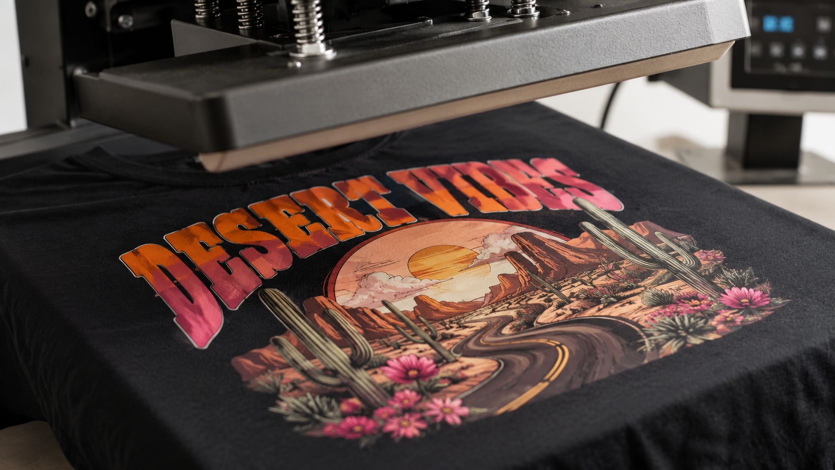
Heat transfer works best when sharpness is part of the design language. Letters, numbers, badge-style shapes, and one-off personalizations often look right with this method because the edges stay defined and placement can be controlled very tightly.
It behaves more like applying a cut graphic than painting with ink. That is why it shows up so often in sports references, jersey-inspired streetwear, event merch, and custom names on the back of a tee. If the concept calls for a graphic that feels precise and deliberate, transfer can fit the story.
Some buyers hear "heat transfer" and assume low quality. That misses the core question. Does the finish match the design? A glossy block number or a sharp sponsor-style chest hit can feel completely intentional on the right shirt, especially when the whole piece is borrowing energy from uniforms, racing gear, or bootleg-style street graphics.
Sublimation for all-over energy
Sublimation goes after a very different look. Instead of sitting on top of the fabric, the color bonds into polyester fibers during production. On the body, that usually means a lighter feel and a graphic that does not have that separate printed layer.
For streetwear, the appeal is scale. Sublimation handles artwork that wants to run big, wrap wide, or cover the whole garment with motion. Loud pattern work, surreal scenic prints, and edge-to-edge color all make sense here. If you want a tee that feels more like a poster wrapped around a silhouette, sublimation is built for that job.
The tradeoff is fabric character. Sublimation shines on polyester or polyester-rich garments, not the cotton-heavy blank that many streetwear fans want for a dry hand feel and a more classic drape. So the question is not whether sublimation is good. It is whether the fabric and the visual idea belong together.
Discharge for vintage softness
Discharge printing speaks to a different crowd. This method removes the garment dye and replaces it with new color, which can leave the print soft and breathable, especially on dark cotton shirts. The result often feels less like ink sitting on black fabric and more like the graphic is part of the shirt itself.
That quality matters if you are chasing a worn-in look. Vintage band tees, faded tourist shirts, and older skate graphics rarely feel plastic or heavy. They feel settled. Discharge gets closer to that character than many top-layer print methods, which is why designers use it when they want age, softness, and a quieter finish from day one.
If the design brief is "found this in a stack and never took it off," discharge is often the right lane.
Here's a quick visual walkthrough of a pressing workflow before we zoom back out to design choices.
Where people make mistakes with placement
A solid print can still fail if the size is off. Placement works like proportions in a fit. A back graphic that looks balanced on an adult large can swallow a youth tee. A pocket hit that is a little too big stops reading subtle and starts looking awkward.
A few size limits keep things in control:
- Youth smalls: Keep the safe zone at 8.5 x 8.5 inches.
- Youth medium and large placements: Use 5 x 5 inches max for small placement areas.
- Pocket prints: Stay under 3.5 x 3.5 inches.
Those guidelines line up with the sizing guidance, placement scenarios, and safety zones covered in this print placement tutorial on YouTube.
That matters most on family sets, matching capsule drops, and scaled-down versions of the same artwork. Good placement keeps the graphic feeling designed for the garment, not just shrunk and dropped wherever it fits.
The Art of the Stitch Understanding Embroidered Graphics
Embroidery isn't really part of the print family. It's closer to building the graphic with thread. That alone changes how the garment reads.
Ink changes the surface. Stitching changes the structure you feel. Even a small embroidered logo adds weight, texture, and a slight raised profile. On the body, that reads as cleaner and more premium than a lot of printed alternatives.
Why embroidery feels premium
Thread catches light differently than ink. It has edge, shadow, and dimension. A tiny star emblem, a city name on a cap, or a compact chest logo can suddenly feel more intentional because the graphic has physical depth.
It's also the most durable application in everyday terms. The thread often outlasts the tee itself if the garment is cared for properly. That's why embroidery shows up so often on caps, heavyweight sweatshirts, and minimalist streetwear pieces that want quiet authority instead of loud imagery.
Where embroidery works best
Embroidery shines when the design is simple enough to translate into stitches.
- Small logos: Ideal for chest marks, sleeve hits, and cap fronts.
- Lettering with presence: Short words and initials usually work better than dense paragraphs.
- Minimal graphics: Symbols, stars, crests, and badges tend to translate well.
Where it struggles is photo realism. Fine tonal transitions, complex portraits, and smoky gradients belong to print methods, not thread.
A good embroidered graphic feels less like a poster on a shirt and more like a mark built into the garment.
That's why embroidery often works best as a restraint move. It doesn't need to shout. It just needs to hold its shape and keep looking sharp.
How Print Methods Shape Streetwear Trends
You spot two nostalgia tees on a rack. Both reference the same era. One feels like a future favorite the second you touch it. The other feels like a souvenir. The artwork may be similar, but the print method changes the whole story.
Streetwear trends are shaped as much by application as by concept. Print is not just a delivery system for the graphic. It controls the vibe, the age, the sharpness, and the way the shirt settles into your wardrobe after ten washes.
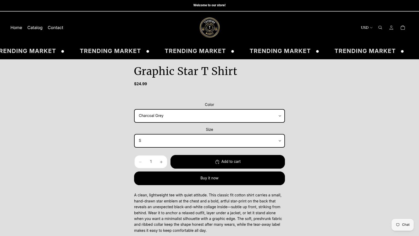
A faded automotive tee usually wants the image to sink into the fabric so it feels broken in from day one. A loud 8-ball graphic usually works better with dense, solid color that sits with confidence on top of the shirt. A small star motif can look stronger when the application stays restrained and precise.
The method carries the mood
Good designers match print behavior to the reference they are borrowing from.
A tour-style photo tee often looks right with a softer, worn-in finish because people connect that look with old merch bins, concert parking lots, and tees that have lived a little. A skate logo or a bold back print usually needs stronger surface presence because the whole point is visibility and impact from a few steps away.
Print method works like casting in a film. The script matters, but the wrong actor changes the tone. The same graphic can read vintage, hype, premium, or flat depending on whether the ink feels airy, crisp, heavy, or glossy.
The best choices feel natural to the wearer. You are not admiring the production process. You are feeling that the tee has the right attitude.
Trend direction is getting more specific
Broad nostalgia still sells, but specific references often feel fresher. Analysts at Alibaba found that nostalgia-led graphics such as 90s cartoons and retro video games drove strong revenue in 2026, while more focused directions such as micro-nostalgia and localized folklore had better profit potential because they faced less saturation, according to Alibaba's 2026 report on best-selling graphic tee designs and profit strategies.
That matters because specific references ask more from production.
Micro-nostalgia lives or dies on accuracy. If a tee pulls from Tamagotchi-style pixel icons, the print needs clean edges and controlled color so the pixels feel intentional instead of muddy. Screen printing can work well here if the art uses a limited palette and wants that bold arcade feel. DTG makes more sense if the design includes tiny interface details, soft shading, or layered collage elements around the central reference.
Localized folklore asks for the same care in a different direction. Say a brand builds a tee around a regional serpent legend or a folk mask motif. If the art has intricate linework, discharge or a soft-hand print can preserve a more lived-in, story-rich feeling on cotton. If the goal is a poster-like graphic with ceremonial colors that hit hard, a denser screen print may carry the idea better. The method should respect the source, not flatten it into a generic tourist-shop image.
A useful way to judge trends is simple:
- Broad retro prints: Best when the production adds character, not just recognition.
- Micro-nostalgia graphics: Best when edges, small details, and texture are controlled with intention.
- Localized motifs: Best when color, line quality, and print feel match the cultural tone of the artwork.
Streetwear has become more selective. Buyers want more than a reference they recognize. They want a shirt that wears the reference in the right voice, and print method is a big part of that voice.
Your Tee's Forever Guide Buying Smart and Making It Last
A good tee starts with the right match between artwork, fabric, and application. A lasting tee also depends on how you buy and how you care for it. Most print disappointments come from one of two mistakes. Either the method didn't match the design, or the shirt got cooked in washing and drying.
The market is also pushing graphics into more experimental territory. In 2026, the global graphic tee market reached $47.3 billion, and the highest revenue growth came from categories like AI-assisted nature hybrids and functional prints with UV-reactive inks, showing that buyers are responding to graphics with a stronger experiential angle, according to Alibaba's 2026 graphic tee consumer insights report. That makes smart buying more important, not less.
A quick buyer checklist
Use this when you're deciding whether a tee is worth it.
- For photos and gradients: Look for a method that handles detail and softness well. If the image has smoke, skin tones, chrome, sunsets, or layered collage effects, a softer fiber-integrated approach usually makes more sense.
- For logos and bold solids: Choose a print with strong opacity and a more durable tactile layer if the artwork is simple and graphic.
- For premium minimal branding: Embroidery often makes more sense than print when the design is small and iconic.
- For odd placements or personalized pieces: Pay close attention to sizing and placement, especially on youth garments and pocket prints.
Care that protects the graphic
You don't need a complicated routine. You need consistency.
- Wash inside out: This reduces direct friction on the graphic.
- Use cold water: High heat is rough on both fabric and applied graphics.
- Skip aggressive drying: Low heat or air drying is kinder to prints.
- Don't iron over the design: Heat and pressure can damage the application surface.
The fastest way to shorten a tee's life is to treat the print like it's just decoration. It's part of the garment's construction.
If you shop with your hands and eyes, not just your taste, you'll start catching the difference fast. The best tee isn't only the one with the coolest artwork. It's the one whose print method makes that artwork worth wearing for a long time.
If you want to put these ideas to work, browse Trending Market with a sharper eye for texture, print feel, and graphic intent. Whether you lean toward music references, automotive visuals, or clean streetwear motifs, knowing how a tee is made helps you choose pieces that won't just look right on the screen, but feel right when they land in your hands.