

You open the package, peel back the mailer, and hold up a case that looks clean online and a little risky in real life. It's supposed to be a graphic phone case, but what exactly are you holding, a TPU shell, a rigid plastic back, a printed layer, or some mix of all three? That question matters more than most shoppers think, because the design is only half the story. The other half is whether that print still looks sharp after keys, pockets, and daily drops get involved.
The category itself sits inside a huge accessory market. The global phone cases market was estimated at US$39.3 billion in 2024 and is projected to reach US$53.9 billion by 2030, which helps explain why graphic styles can thrive as more than a novelty Research and Markets. The broader mobile cases and covers market is also forecast to keep expanding, with overlapping estimates showing continued demand through the next decade Future Market Insights.
That scale creates room for cases that act like tiny billboards for music taste, car culture, city pride, or just a loud aesthetic. It also means buyers need a sharper eye than “looks cool.” The difference between a case that stays fresh and one that looks tired after a month usually starts with the material, the print method, and the fit.
Table of Contents
- What Counts as a Graphic Phone Case
- Materials and Construction Explained
- Print Methods and Why They Matter
- Popular Design Motifs in Streetwear Cases
- Matching Protection Level to Your Daily Life
- Care, Cleaning, and Graphic Longevity
- Styling a Graphic Case With Your Wardrobe
- Buying Checklist and Final Takeaways
What Counts as a Graphic Phone Case
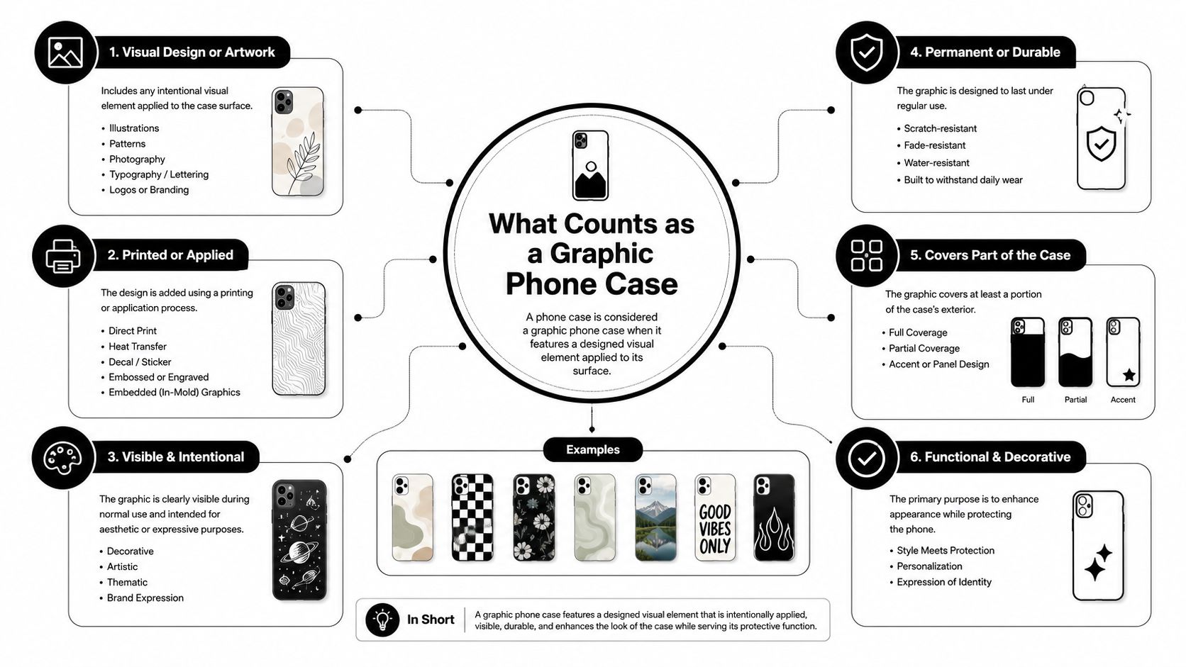
A true graphic phone case is one where the artwork drives the purchase. That could be illustration, photography, bold typography, licensed-style imagery, or a repeating pattern, but the point is the same, the visual identity comes first.
A plain clear case with a tiny logo printed in the corner usually doesn't feel like a graphic case. A full-back dice print, a city skyline wrap, or a tour-photo design does. The best shorthand is this, if the art is the reason you clicked, you're in graphic case territory.
The part people hold, and the part they buy
The hand-feel can be misleading. Two cases may look similar on a product page, yet one is a rigid shell with a printed back and the other is a flexible TPU build with edge graphics that wrap farther around the phone. One may be made to show art vividly. The other may be made to survive daily use with less drama.
Practical rule: if the listing only shows the front art and never mentions fit, material, or print area, assume you're buying style first and should verify protection separately.
That's why the category has become a real shopping lane instead of a throw-in accessory. In a market this large, brands can segment by taste, not just by device. A streetwear-leaning shop can sell a music case, a car-themed case, and a skyline case as three different identities, even if the base construction is similar.
A few terms help a lot when you're browsing:
- Full-print, the artwork covers most of the back.
- Edge-to-edge, the design carries into the side or curved area.
- Raised-bezel graphic, the visual print sits on a case with lifted lips around the screen and camera.
- Themed collection, several cases share one motif family, like automotive or city imagery.
A buyer who understands those labels stops treating every “cool phone case” as the same thing. That's where the comparison starts.
Materials and Construction Explained
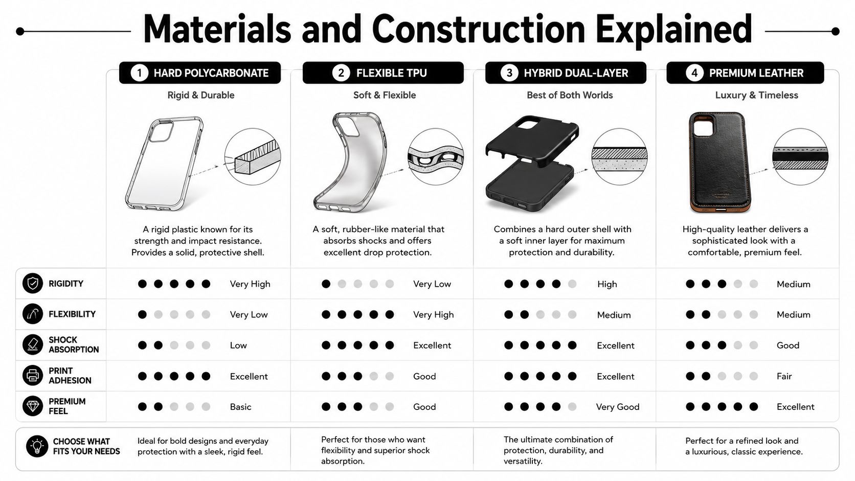
A graphic case can only look as good as the shell underneath it. The material controls the feel in the hand, how the phone bounces when it hits a table, and how well the print survives rubbing.
Hard shells, soft shells, and hybrids
Polycarbonate is the stiff one, like a Lego brick. It keeps its shape, shows off sharp artwork well, and often makes photographic prints pop on glossy surfaces. The tradeoff is that it can scratch more easily than softer materials.
TPU, or thermoplastic polyurethane, is the flexible one. It feels closer to a rubber band or a soft bumper. It bends around buttons and ports, adds grip, and usually handles daily handling better than a slick hard shell. It can also work well with printed graphics, especially when the design needs a little give along the edges.
Silicone is grippy and soft, almost like a kitchen spatula in feel. It tends to cling in a pocket and collect lint more than the other materials, but some buyers like the cushioned feel. The print can look good, though the surface usually reads less crisp than a hard glossy back.
Hybrid TPU plus PC cases are the compromise build. They try to mix a rigid back with a flexible bumper, so the case feels sturdier without becoming a tank. For people who want a graphic case that doesn't feel flimsy, this is often the middle road.
2D flat cases and 3D wraparound cases
The other split is visual. A 2D flat case keeps the art on a flatter plane, usually on a rigid shell or tinted TPU. It's simpler to clean and often cheaper to produce. A 3D wraparound case extends art over curved edges, which can look more premium and immersive.
That wraparound look comes with a catch, though. More surface coverage means more places for dirt and wear to show, especially around seams and edges. It can look great on day one and slightly fussier on day ninety.
A good listing should tell you the exact device model, the material, and whether the print covers just the back or the full exterior. If it doesn't, treat it like an incomplete spec sheet.
For buyers, the simplest move is to match the feel to the use case. If you want a crisp visual statement, hard shells often do that best. If you want a case that feels less slippery, TPU usually makes more sense. If you want both, a hybrid build is often the safer bet.
Print Methods and Why They Matter
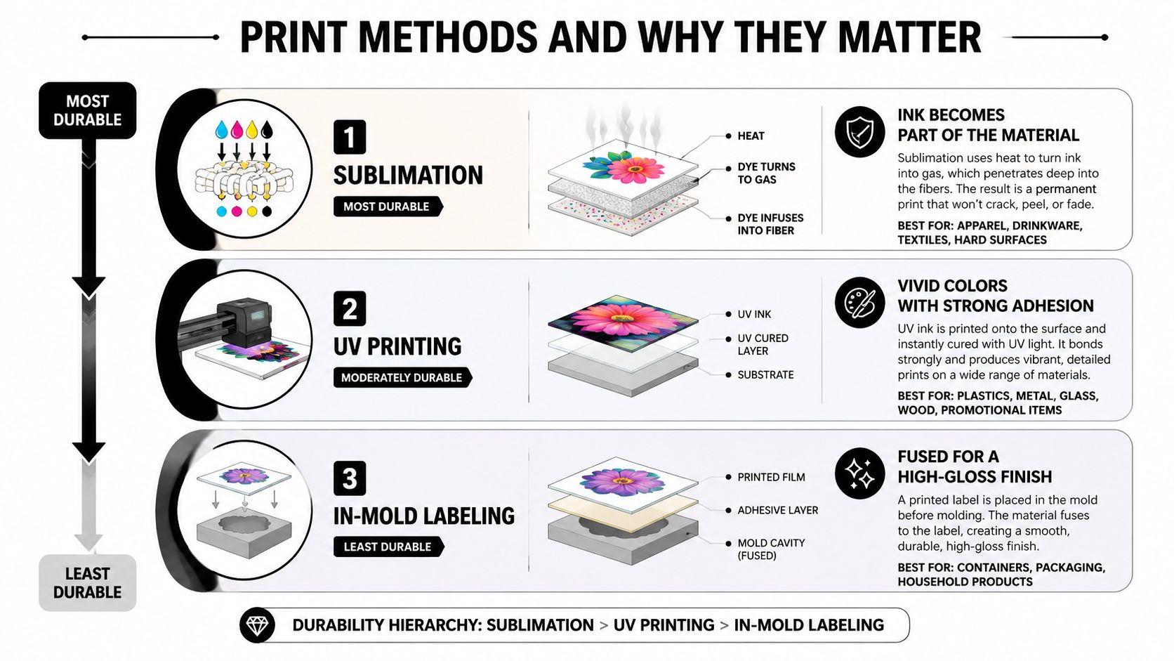
Two graphic cases can look almost identical in a storefront and age very differently once they leave the box. That's usually because the print method is hidden behind the pretty mockup.
What the main methods do
Sublimation pushes dye into a coated surface. The result can look vivid and photographic, because the color becomes part of the finish instead of sitting loosely on top of it. That's why it's often used for rich full-color art.
UV printing cures ink on the surface with ultraviolet light. It can produce bright color and crisp details, which is useful for bold graphics and typography. The surface layer is still the layer you touch, though, so abrasion can become visible sooner than with a more embedded method.
In-mold decoration fuses the artwork during forming, so the print is integrated into the material rather than added later. That usually gives it a durable, polished feel, especially on cases where the design and shell are meant to look like one object.
Why resolution matters more than people think
A design file that looks fine on a laptop can turn mushy on a phone case if the source is too small. Print-ready guidance for custom cases generally points buyers toward 300 DPI artwork and a canvas around 1000 × 1500 px or higher, with some recommendations going up to 2400 × 1200 px at 300 DPI for full-back coverage Template.net. The reason is simple, a phone case stretches art across curves and cutouts, and low-resolution files show their flaws fast.
Useful rule: if the product image is ultra-crisp but the uploaded art is a compressed screenshot, the final case will usually look closer to the screenshot than the mockup.
A glossy finish can make photo-style art feel expensive, but it also highlights scratches and compression issues. Matte surfaces hide a little more, though they can mute the punch of some colors. The right choice depends on whether you want your case to read like a poster or a piece of gear.
Popular Design Motifs in Streetwear Cases
Streetwear graphic cases usually fall into a few recognizable lanes. The motif tells people what tribe you're borrowing from, or what you're signaling without saying anything.
Four design families that keep showing up
| Motif | Buyer Persona | Visual Cues |
|---|---|---|
| Music and tour references | The fan who wears taste on purpose | Album art, tour photos, performer names, ticket-style layouts |
| Automotive and tuner culture | The person who reads a car the way others read a logo | BMW, GT-R, classic truck, performance cues, wheel graphics |
| City and skyline graphics | The buyer who wants location and identity in one object | Borough names, skyline silhouettes, map-inspired layouts |
| Dice, gambling, and arcade iconography | The shopper who wants playful street energy without a heavy scene commitment | Dice, lucky numbers, neon, casino or game motifs |
The appeal is partly social. A graphic case can start a conversation at a coffee counter or in class because it shows a taste profile in one glance. It can also behave differently depending on the rest of the outfit, which is why some people rotate cases the same way they rotate hats.
Trending Market's catalog leans into this logic with music, automotive, and city references across tees, caps, and cases, so the phone accessory doesn't feel detached from the rest of the wardrobe.
A dice case can read as playful on one day and sharp on another if the outfit is otherwise restrained. A skyline case can feel personal to someone from that city, but it can also work as a clean visual anchor for someone who just likes the architecture of the print. That flexibility is the whole point of the category.
Matching Protection Level to Your Daily Life
A graphic case still has to do the boring job of protecting the phone. If you buy for visuals alone, you may end up with a case that looks right and works wrong.
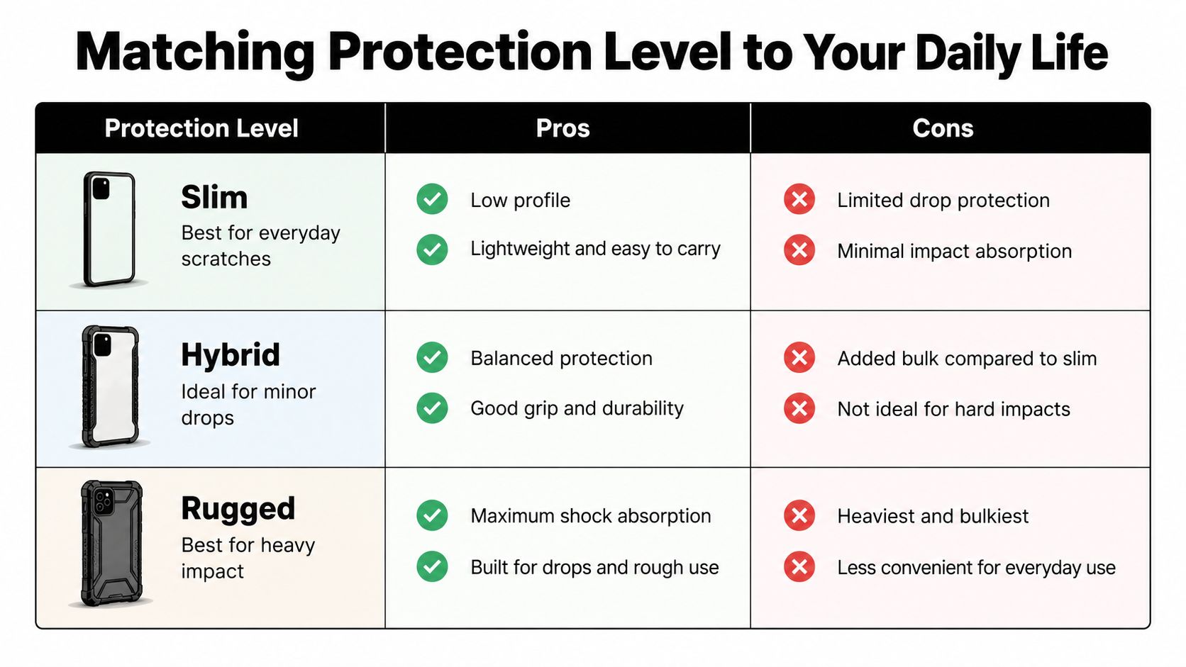
The three protection tiers
Slim cases are for everyday scratches and light bumps. They're low-profile, usually easy to slide into a pocket, and they keep the graphic visible without adding much bulk.
Hybrid cases try to balance style and protection. They often use a rigid back with a flexible bumper, plus raised edges around the screen and camera. That extra structure helps when the phone lands awkwardly, but it can make edge-to-edge art less continuous.
Rugged cases are for heavier impact and rougher environments. They're thicker, more layered, and more obvious in the hand. You get more shock absorption, but you also get more visual interruption if your favorite design depends on slim borders.
Match the case to the way you actually use the phone
If your phone mostly lives in a jacket pocket and comes out for messages and photos, slim or hybrid usually makes more sense than a heavy-duty shell. If you're on a job site, clip your phone to a belt loop, or drop it often, thicker protection becomes the smarter purchase even if it hides some of the print.
The fastest test is simple. If you care more about the art staying visible, lean slim. If you care more about the phone surviving a bad day, lean hybrid or rugged.
You can also use a quick decision rule. Pick protection first, then design. That sequence prevents the most common regret, which is buying a gorgeous case that feels too fragile for real life. The phone stays safer, and you stop having to choose between a cool graphic and a case you trust.
Care, Cleaning, and Graphic Longevity
A case doesn't fail all at once. It ages in little visible ways, and those small changes tell you a lot about how the print method and material are holding up.
What usually happens over time
The first wear often shows up at the edges, where the case rubs against pockets, coins, and keys. Glossy polycarbonate can pick up micro-scratches that catch the light. Clear TPU can yellow. Printed areas near the camera cutout can start to peel if the design was applied only to the top layer.
That doesn't mean every case falls apart quickly. It means wear shows up where friction is highest, and the finish matters. Dark, high-contrast art usually makes scratches easier to notice, while busy textured artwork can hide small marks better.
A simple care routine that helps
- Wipe gently: Use a soft cloth and mild soap when the case needs cleaning.
- Avoid harsh cleaning habits: Strong alcohol wipes can be rough on some finishes, especially when the print sits on the surface.
- Keep it out of hot cars: Direct sun on a dashboard can accelerate warping or fading.
- Rotate cases: If you like to wear a case like you wear caps, switching designs gives each one a break from friction.
Matte finishes hide fingerprints better than glossy ones, but they also change how the print reads in bright light. That's part of the tradeoff. You're not just buying an image, you're buying how that image ages.
The expectation is this, a well-made graphic case can look solid for everyday use, but the visible life of the print depends on the finish, the cleaning habits, and how hard the surface gets worked. A buyer who understands that won't be surprised when the case starts showing character.
Styling a Graphic Case With Your Wardrobe
A graphic case works like the smallest accessory in your outfit, except everyone sees it when you pull your phone out. That makes it more useful than it gets credit for.
Three easy formulas
Graphic tee plus matching case works when the art shares a mood but not necessarily the exact same print. A Drake tour tee with a dice case and a matching cap can feel coordinated without looking staged.
Neutral tee plus loud case lets the case do the talking. White, black, or gray outfits are the cleanest backdrop for a full-color design, especially if the case is busy or photo-based.
Monochrome outfit plus city case gives you a subtle anchor. A black hoodie, black cargos, and a skyline case can look intentional without becoming costume-y.
The accessories around the case matter too. A trucker cap can echo a city motif. A quarter-zip can soften a car-themed case. A denim jacket can keep a bright graphic from feeling overworked. The goal is to repeat the theme once, not five times.
If every piece of your outfit screams at the same volume, the case stops reading like a detail and starts reading like clutter.
The simplest streetwear move is to let the case be the accent. If the case is bold, let the rest of the outfit stay calm. If the outfit is already loud, choose a case that shares the palette but not the same level of noise. That balance keeps the look wearable.
Buying Checklist and Final Takeaways
A smart purchase starts before you fall in love with the design. The more you check up front, the less likely you are to end up with a case that looks right and fits wrong.
Five checks to run before you buy
- Confirm the exact device model. Button placement, camera cutouts, and speaker openings need to match.
- Choose protection first. Slim, hybrid, or rugged should be decided before you browse prints.
- Check the print method and finish. Surface prints, embedded prints, glossy, and matte all age differently.
- Match the motif to your wardrobe. Buy a design you'll wear, not just admire in the cart.
- Read shipping and return terms. Graphic cases are easier to regret when the fit is off and the policy is vague.
If you're comparing options, pay attention to whether the seller shows the actual case geometry or just a flat mockup. A retailer like Trending Market, for example, presents streetwear-led accessories alongside tees and caps, which makes it easier to choose a case that fits into an existing style system rather than floating alone as a random purchase. That kind of catalog structure can help, but it still doesn't replace checking the specs.
Quick answers to the questions buyers keep asking
How do I spot a low-resolution print? Blurry edges, jagged text, and soft detail around thin lines are the usual tells.
Will wireless charging still work through a thick case? It often depends on thickness and design, so check the product details instead of assuming.
How do I remove a case that's stuck from heat? Let the phone cool down first, then ease one corner off gradually instead of bending hard at the middle.
What if my favorite design gets discontinued? Save the product photos, note the motif, and look for a similar print method and material in the next drop.
The best way to shop graphic phone cases is to treat them like gear, not just decoration. Pick the right material, choose the right print method, and only then decide which design you want to carry every day.
If you're ready to upgrade your phone case without guessing at the specs, visit Trending Market and compare the current graphic accessories with the clothes you already wear.